Practical Guide: Adapting Everyday Photos for Professional Web Banners
Web Design Skills · Practical Tutorials · By Elwyn Davies
Why This Matters
If you’ve been designing websites for longer than five minutes, you’ll know this pain all too well. Picture the scene: you’ve crafted a beautiful, ultra-wide website banner with plenty of breathing room, space for the headline, maybe an action button. Suddenly, your client hands over a group photo taken at someone’s birthday, fresh from the family smartphone.
Your client loves that photo (always), but it’s a standard rectangle, vertical or square, not remotely the expansive shape your site needs. Crop it and you’ll cut off grandma. Stretch it and everyone looks like they’ve had a run-in with a carnival mirror. And let’s not get started on how much time you can lose to “could we try cropping it slightly differently?” emails.

For small agencies and freelancers especially, this is a weekly occurrence. You may not have a professional photographer on speed dial or a client with budget for a reshoot. But you still need to deliver a site that looks professional, with no odd photo stretching or bizarre cut-offs that scream “we made do.”
A good banner image can make the site appear trustworthy. When you solve this problem efficiently (and without upsetting the client by butchering their favourite photo) you save hours, keep your stress in check, and seriously boost perceived value.
Common Pitfalls
Most people trip up in the same places every time:
-
Stretching the image outright. Yes, it fills the space, but now everyone looks three feet taller and slightly haunted.
-
Heavy cropping. You end up trimming off the people or details that actually matter to the client, and are asked to redo it ten times.
-
Ignoring blank space. Slapping the photo in the middle and leaving coloured boxes either side might fill the banner… but it looks like a PowerPoint from 2008.
-
Adding awkward repeats or mirrored edges. Or, the desperate “smudge it with the clone tool” that just about works if your client’s website is about clouds, and the photo is of more clouds.
Often, designers don’t realise there are now tools that, with a bit of know-how, will expand photos sideways for you with results that actually hold up. But more on that below.
Step-by-Step Fix
Let’s run through a practical, tried-and-tested process to take that everyday client photo and turn it into a beautiful, ultra-wide banner. Don’t worry: you don’t need magic, just Photoshop (2023 version or newer), a half an eye for detail, and a little patience.
1. Get to Know the Starting Material
Start simple. Pop the photo in Photoshop. Take a moment to actually look at it. Ask yourself:
- What is non-negotiable? (Is it the people, the landmark, the company logo on the mug…)
- What areas are visually simple? (Sky, walls, grass, water—all things the software is happy to extend.)
- What’s the mood? (A cheery office group shot needs a different treatment from a serious architectural wide-angle.)
This helps you work out what you can afford to “grow” and what has to stay as is.
Never start stretching or cropping until you know what part of the photo the client loves most. If possible, ask them! Saves headaches later.
2. Set Up the Banner Canvas
Decide on your final desired banner size. On average, website banners run between 1920×600 and 2560×800 pixels, but check your design. In Photoshop, with your image open:
- Head to Image > Canvas Size.
- Extend the width only, not the height.
- Fill the new side areas with transparency or a neutral colour. This makes it obvious which bits need generating.
This gives Photoshop “blank” areas to work with, and a visual guide for you.
Add guidelines or a temporary layer showing your "safe zone" for text. Saves hassle when you later integrate with the website.
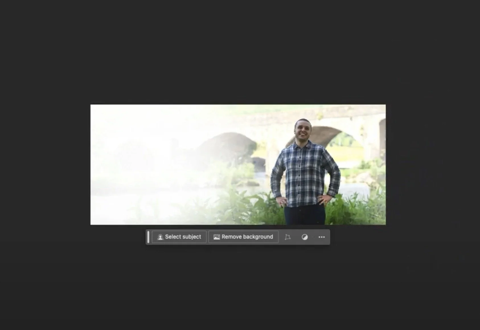
3. Use Content-Aware Fill to Extend the Sides
Now comes the clever bit. Select the newly added blank areas using the Marquee tool (do one side at a time for control). Then:
- Right click > Fill > Choose Content-Aware.
- Let Photoshop do its thing.
With luck, you’ll now see the grass, sky, wall, carpet, or whatever else, “grow” into the empty areas, matching colour and texture instead of obviously repeating patterns.
Repeat on the other side.
If it looks obviously fake, undo, select a slightly different area, or try the “Content Aware Move” tool to shift in some nearby pixels. Sometimes, the AI needs a nudge.
4. Clean Up the Composite
No clever tool is perfect (yet). Scan the new bits for weirdness. Look out for:
- Blurred edges, doubled-up heads, bizarre cloud swirls
- Comically large pieces of desk, or patterns that repeat just a bit too perfectly
Use the Spot Healing Brush or Clone Stamp, on a low opacity, to blend out any obvious seams or artefacts.
Zoom out occasionally. What looks wrong at 100% sometimes disappears at banner size.
Less is more with manual touch-up. Over-blending makes things look unnatural. Just aim to remove anything obviously distracting.
5. Check the Focal Areas and Prep for Overlay Text
Before you call it finished, check:
- Is the main subject still clean and in the “visual centre”?
- Do you have enough plain space above/below or to the sides for your text to show up?
- Are there any bright or dark blobs under where text will sit?
If the answer to any of these is no, you may need to adjust your extension, or even mask out the subject and subtly blur or brighten the background round them.
Duplicate your banner and lay a temporary headline over it. If the text disappears into the photo, brighten or darken the background using a soft gradient or adjustment layer. Always make sure legibility comes first.
6. Export Smart (and Don’t Forget Compression)
Now it’s time to save your new banner in the right format. Use Save for Web (or Export As) and go for high-quality JPEG or PNG (rarely, WEBP if your platform likes it).
Double check the final file size: even a perfect banner is no good if it makes your website crawl. Aim for under 500KB if humanly possible. Sometimes, a gentle 80% quality setting works wonders.
Use an image compression website to check load time. Google will punish slow pages, and your users will thank you.
What Most People Miss
You’d be surprised how many designers still try to hide the short edges of a standard photo behind coloured boxes or chunky gradients. Remember this: some of the most “professional” banners started out as less-than-perfect wide shots, then were carefully extended during editing work to suit the layout, all while protecting the important areas.
It comes down to subtlety, not illusion. No one’s expecting you to generate an entire city skyline where there was none. Make the most of what’s already present. Keep your overlays tidy, and even the most ordinary photo can pass as a high-budget banner.
Want to impress your client? Show them a side-by-side: the original photo, and the banner-ready version. Most won’t spot where the new bits start and the original ends. In web design, that’s worth its weight.
The Bigger Picture
Once you nail this, weak photo assets stop blocking your projects. You’ll spend less time arguing about photography budgets, and more time actually designing. You also avoid being cornered into the unprofessional solution where you crop faces or stretch proportions out of shape. Visitors stick around, and your client’s brand comes off as sharp.
Over months and years, this trick saves you countless hours. Build up a folder of “banner-ready” templates and you’ll run through this process in minutes. Clients notice. Word spreads. Soon you’re the designer people trust to “make it work.” There aren’t many who get that reputation.
One benefit: you’ll get better at spotting which photos can be saved and which just won’t work at 1920px width. That spares you awkward conversations later plus a hard drive full of abandoned experiments.
Wrap-Up
Turning an everyday iPhone snapshot into a professional web banner doesn’t require magic anymore. With Photoshop’s AI features and a sceptical eye, just about anyone can pull it off. You’ll save time, lower costs, and keep both designer and client smiling.
Keep this in mind—your job isn’t to fake perfection. Do your best with what you have, and use smart edits to improve what’s already there.
Want more practical guides like this from experienced folks? Join Pixelhaze Academy for free at https://www.pixelhaze.academy/membership. Web design gets a whole lot easier when you have the right tools, the right attitude, and a little help from others who’ve faced the same challenges.
FAQs & Jargon Buster
Q: What if my client’s photo has lots of people near the edges?
A: That makes things trickier. Extending backgrounds like sky or walls works better than “growing” people. Crop tightly if you must, or gently blur/extend the empty space around groups instead of the subjects themselves.
Q: Does this technique work in cheaper tools than Photoshop?
A: Some online editors (like Canva or Fotor) try to mimic content-aware fill, but nothing beats Photoshop’s version. Free alternatives can get you part way, but the finish won’t be as seamless.
Q: Will this work for every single photo?
A: No. If there’s detail right up to the edge, or busy backgrounds, the results might look odd. Choose photos with plenty of blank or simple space either side of the main subject for the best outcome.
Q: Can I automate this fully?
A: Not yet. You’ll always need a human to check and tidy the rough bits. If you spot a miracle auto-expanding tool, let us know.
Jargon Buster:

- Content-Aware Fill: Photoshop’s tool for extending or filling areas in a photo by analysing the surrounding pixels and guessing what should go in the blank spots.
- Clone Stamp/Healing Brush: Manual tools to cover blemishes and blend edges, perfect for tidying up after the AI’s had a go.
- Web banner: The wide, shallow image strip at the top of most modern web pages. It’s often the first thing visitors see.
Related Posts from Pixelhaze
- Mastering Content-Aware Tools in Photoshop 2024
- Image Compression in Web Design: Why It Still Matters in 2024
- Choosing Between Professional Photography and Photoshop
- Photoshop Tutorial: Transforming AI-Generated Images into Retro-Futurism Artwork
- What Does a UX/UI Designer Do in Web Design?
About the Author
Elwyn Davies
Elwyn brings more than two decades of small business, web design, front-end development and project management experience (including plenty of rescued client photos) to the Pixelhaze Academy. If he wasn’t building websites, he’d probably be teaching chemistry, rambling about design history, or quietly fixing things no one else wanted to touch. He’s here to help you make web projects less stressful, step by step.
Pixelhaze Academy: Practical web design coaching for humans, by humans. No superheroes or AI hype needed.