10 Stunning Squarespace Templates to Elevate Your Website Design in 2023
Why This Matters
Let’s be honest: wrangling your website into something that both impresses your clients and works flawlessly can feel a bit like assembling flat-pack furniture without the instructions. You know it’s possible, everyone else seems to manage, but when you actually look at all those template thumbnails, it’s easy to get stuck. Hours disappear, confidence wobbles, and by tea time you’re googling “Can I just use a Word doc instead of a website?”
The truth is, your website is your digital front door for your business, portfolio, or passion project. Get it right, and you’ll save yourself from a mountain of late-night edits, misaligned branding, and distracting technical snags. Get it wrong, and you might as well be hanging a ‘Closed’ sign on your virtual shop.
Picking the right Squarespace template can seriously shortcut the faff. You get a professional look and also sidestep lots of technical potholes. Your site loads faster, your message lands better, and Google is more likely to send people your way without charging a finder’s fee. So the stakes aren’t small.

Whether you’re a one-person startup, busy café owner, or just someone keen to dodge web design headaches, finding that spot-on template is the bit that makes the rest of your digital efforts… well, possible.
Common Pitfalls
You’ve probably been there: scrolling through template after template, eyes glazing over at all the glossy thumbnails. You land on one that looks fabulous, but once you put your own content in, it ends up with all the personality of a beige cardigan.
Here are the classic tripwires most folks hit:
- Choosing purely on looks, while totally ignoring what the site actually needs to do.
- Forgetting who your visitors are (real people, not design judges).
- Overlooking customisation and then realising you can’t tweak it without tossing your brand guidelines in the bin.
- Underestimating how a restrictive template can block you as your business grows.
- Skipping out on the practical bits like mobile experience and SEO tools.
These aren’t one-off mistakes, either. They stack up, leading you to spend hours troubleshooting, or even worse: redoing the whole thing from scratch six months later.
Let’s clear away the waffle and focus on making a decision that solves the actual problem and keeps solving it as your business continues to develop.
Step-by-Step Fix
Time to break it down, step by step, with practical advice pulled straight from the Pixelhaze workshop. Let’s get you from “help!” to “sorted.”
Step 1: Pin Down Your Website’s True Objective
Before you open so much as a single demo site, grab a notebook (or the back of an envelope if that's more your style) and answer: What job does your website actually need to do?
Is it showing off a gallery? Selling homemade candles? Getting people to call you for a quote? Every template is built with a certain purpose in mind, even if the designer was thinking “minimalist plant shop” and you’re running a book club. Force-fitting a template meant for e-commerce into a simple brochure site is like buying a double-decker bus for the school run.
Pixelhaze Tip
If you’re not sure where to start, list out your three top goals (e.g., “I want visitors to see my photography, understand my service, and get in touch easily”), and keep them in front of you as you shop for templates. If a template doesn’t make those easy, move on.
Step 2: Get to Know Your Audience (Like, Really Know Them)
This is the bit where the magic happens. A portfolio site for a wedding photographer and an IT service provider aren’t going to appeal to the same people. Millennials might love a swipey, image-led homepage; accountants want things crisp, clear, and credible.
Think: Who will be pressing the buttons on your site? What devices are they using? What frustrates them? If your customer just wants your phone number and a look at your credentials, there’s no use picking a jazzy design with endless parallax sections.
Pixelhaze Tip
Sketch out a quick “day in the life” of your ideal visitor. Where do they get stuck? What makes them click away? If a template won’t make their life easier, it’s not the one.
Step 3: Prioritise Customisation (Because You’ll Want to Tinker)
Hand on heart, I’ve never seen a template that didn’t benefit from a bit of a personal touch. The danger is, some templates are as stubborn as a jar lid that won’t budge. Make sure you can switch fonts, change colours, reorder sections, and add your own images without dipping into code or buying third-party add-ons.
What about plugins? Do you need bookings, an e-commerce tab, a newsletter pop-up? Check now, not after your grand launch.
Pixelhaze Tip
Find templates built for your version of Squarespace (7.1 is the current default), as these are easiest to tweak and future-proof as new features get rolled out.
Step 4: Use the Demo Content Properly
Once you’ve narrowed it down, play with the demo, not just admire it. Replace demo text and images with your rough content, even if it’s “Lorem Ipsum.” This is the fastest route to find hidden problems. Does the homepage headline fit, or does it get squished into a single line like a newspaper classified?
Push the limits: upload a big logo, try swapping the navigation order, see what happens if you add more services than the template shows. If things start looking wonky, you’ll know now, not when you’re two weeks from a product launch.
Pixelhaze Tip
On a test run, use your lowest-resolution image and see how the template handles it. If it suddenly looks like you’re selling potatoes at a car boot sale, look elsewhere.
Step 5: Check for Built-in SEO and Performance Tools
It’s boring, but vital. You want your shiny new website to pop up on Google, not sink like a stone. The best Squarespace templates come with baked-in SEO features: easy ALT text editing, mobile-ready layouts, and fast load speeds are all non-negotiables.
Test a demo page on your phone and a friend’s laptop. If it’s clunky or slow, remember: your visitors are even less patient.
Pixelhaze Tip
Take a screenshot of your homepage on your phone, then on a desktop. If it doesn’t look inviting on both, the design’s not ready for prime time, no matter what the template gallery promises.
Step 6: Choose Your Winner From These 10 Standouts
This is what you’re here for: a tight shortlist of templates we’ve either built ourselves or tested in the real world, with quirks sorted out. Each one is best for a particular type of project, but all are versatile, dependable, and customizable.
1. Cefn-y-Coed Holiday Cottage
Best for: Holiday lets, B&Bs, rural escapes
There’s something quietly inviting about Cefn-y-Coed. It nails the balance between homely and professional, which is exactly what you want when convincing someone to commit their next weekend away to your property. Built to show off large images and easy booking contact, it includes custom sections for directions and guest reviews.
Pros:
- Simple yet polished framework
- Welcoming design you can easily personalise
- Bookings and contact sections integrated
Cons:
- Works best if you’ve got strong photography
- Not ideal for complex e-commerce
2. LogicLabs
Best for: IT support, consultancies, digital services
LogicLabs shows that clean doesn’t have to mean dull. With clear service blocks and plenty of icons, it’s perfect for explainer content and case studies. There’s enough space for testimonials, FAQs, and the odd technical diagram without it morphing into spaghetti.
Pros:
- Very modern, professional vibe
- Handles lots of services or team bios without clutter
- Dark/light themes available
Cons:
- Technical look won’t fit creatives or lifestyle brands
- Limited e-commerce, not for big stores
3. Galbraith Jewellery
Best for: Independent jewellers, boutiques, craft sellers
A template that looks as good as a display case, Galbraith Jewellery is made for close-ups and big, bold product images. Built-in e-commerce means you don’t need to fight with plugins. Also, neutral backgrounds help content shine, which is ideal for anyone with beautiful product photos.
Pros:
- Minimal layout, lets your products do the talking
- Fast, simple path to checkout
- Elegant catalogue-style navigation
Cons:
- Not a fit for service-based sites
- Needs careful image curation
4. Richmond Street Cafe
Best for: Cafés, small restaurants, food trucks
Every café craves that “pull up a chair” feel. Richmond Street sets the mood with warm colours and irresistible menu blocks. Google Maps, table bookings, and menu PDFs click right in.
Pros:
- Responsive on mobile for on-the-go customers
- Easy sections for menus, reviews, events
- Atmospheric but never fussy
Cons:
- Limited for e-commerce stores
- Might need imagery with the right vibe to work best
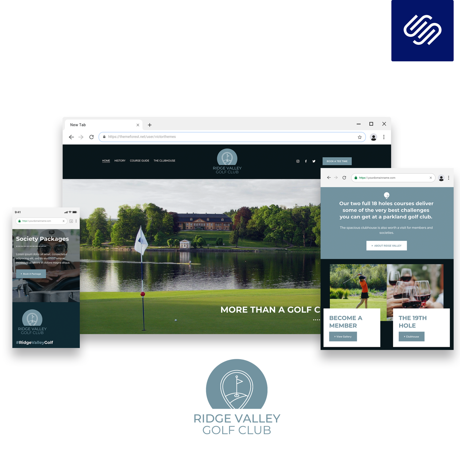
5. Ridge Valley Golf Club
Best for: Sports clubs, community groups, membership societies
If your site needs to look sharp but approachable, Ridge Valley is your friend. Features include layered navigation for events, results, and booking forms. Plenty of space for photos adds to the club spirit.
Pros:
- Professional look without being corporate
- Integrates events calendar and membership
- Good for clubs with lots of updates
Cons:
- Design is very tied to branding, works best if you have a logo and colours ready, not so much if you’re starting from scratch
6. KJ Rees Builders
Best for: Builders, construction, home improvement
Features the snazzy Gallery Wall Plugin, which works like your company’s achievement board—just with a little more polish. Designed for galleries of past projects, testimonials, and easy-to-browse service lists.
Pros:
- Gallery look, perfect for project portfolios
- Solid, grounded design gives instant credibility
- Custom plugins for extra wow factor
Cons:
- Specialist look, maybe too “builder” for consultants or creatives
7. Greening & Co
Best for: Accountants, solicitors, professional services
Blends modern confidence with classic trust vibes: muted blues and greys, plenty of white space, and logical navigation. Homepages can showcase credentials and help build trust before visitors have even made contact.
Pros:
- Instantly credible
- Geared for information-heavy content
- Subtle calls-to-action throughout
Cons:
- Serious tone may not fit non-corporate brands
8. Sway (Christy Price)
Best for: Course creators, service providers, bloggers
Sway’s minimalism isn’t an accident. The layout puts your story or service offer at the centre. Ideal for content-heavy sites or long-form blogging. It’s tweakable for any colour palette, but never lets visuals get in the way of words.
Pros:
- Outstanding for storytelling
- Effortless navigation
- Ghost-style blog homepage
Cons:
- Not built for e-commerce stores
- Needs strong, original content
9. Spice (Christy Price)
Best for: Virtual assistants, freelancers, coaches
Fresh, unfussy, and a little bit retro, that's Spice. Perfect for solo entrepreneurs who want credibility and personality in equal measure. Your services get the breathing room they deserve, without heavyweight graphics.
Pros:
- Instantly approachable, friendly feel
- All service details on one page if you want
- Easy to adjust for brand colour schemes
Cons:
- Simpler than some, not strong on e-commerce
10. Formed by Glaciers
Best for: Modern e-commerce brands, visual portfolios
This one's sleek, full of big product images and distinct section breaks. Formed by Glaciers is excellent for brands aiming to look premium or a cut above the crowd. The template can handle lots of growth, so you can start modest and build up quickly.
Pros:
- Great for showing off visual products
- Scalable as your catalogue grows
- Shopping experience feels smooth
Cons:
- You’ll need to be confident with bold design choices
- Not as suitable for businesses whose focus is mostly content
What Most People Miss
Here’s where most sensible people trip up: They assume the template is the whole journey, but actually it’s just the framework you start with. Templates are like adjustable shelves in a kitchen unit; the real job is arranging everything so it fits your own ingredients.
Chasing the “perfect” layout that never needs to change is tempting. In real life, every template needs a test run with your actual content, and sites that get updated as the business develops end up working best—not just the day you launch.
Another little-known hack: Resist the urge to go heavy on customisation at the start. Do the basics first, keep your tinkering light, and gather feedback once your site is live. When you know what your audience likes, then bring out the creative ideas for the next stage.
The Bigger Picture
Spending a few extra hours to rigorously test your options is an investment, not a delay. Once you’re up and running with the right template, updating your site becomes a half-hour job instead of a marathon. You get a website that actually works for your audience, not just yourself.
Even better, knowing how to select the right template means you avoid the endless redesign cycle that catches so many small businesses out. Your branding stays clean. Your messaging stays sharp. Trust grows every time someone lands on your homepage.
On top of that, a site that’s easy to update and fits your actual needs will keep up the pace as you grow, try new ideas, or land a bigger opportunity. That’s more time working on your business, not stuck in web design limbo.
Wrap-Up
It’s tempting to look for the most striking Squarespace template, pick it, and move on. But focusing on your real objectives, your audience’s habits, and whether a template can flex without causing you grief is what turns a static website into one that pulls its weight.

Once you’ve picked a template that suits you, test it out, tweak just enough, and let real user feedback shape your next upgrade. The best website isn’t the one packed with flashy graphics—it’s the one you’ve got the confidence to keep improving over time.
Want more helpful systems like this? Join Pixelhaze Academy for free at https://www.pixelhaze.academy/membership.