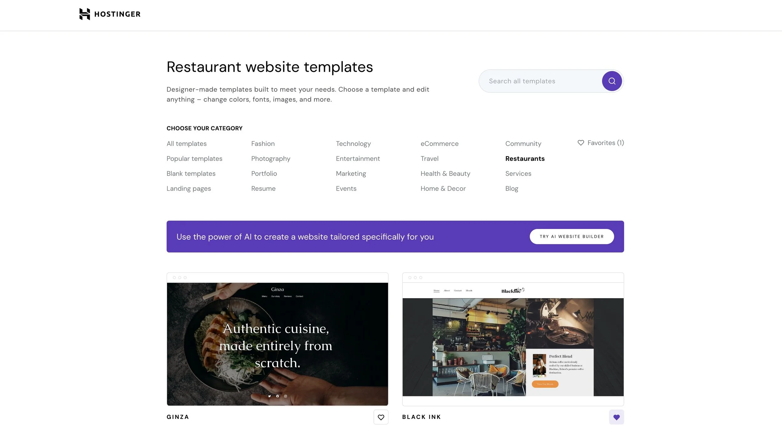
Our first Hostinger Website Template is now live, and it’s free!
If you’ve ever told yourself, “There’s got to be an easier way to get a beautiful, flexible website up and running without mortgaging my sanity,” you’re not alone. I’ve spent longer than I’d like to admit doodling wireframes and mapping out design ideas on chalkboard walls, all in the spirit of unblocking the pain points that come with website creation. Today marks a first in our journey: the debut of our Hostinger template, Black Ink, now available in their Website Builder library. It’s free.
Why This Matters
Getting a website online shouldn’t feel like learning exploratory surgery. Yet, for small business owners, especially in hospitality, the go-to templates are often rigid, uninspiring, or require a wizard’s knowledge of CSS to look even remotely on-brand. Time evaporates, money leaks into “customisation fees,” and after the third attempt your logo still hovers awkwardly next to a stock cupcake.
Switching platforms can add another layer of bother. Many of our users have built brands on Squarespace, only to find themselves eyeing Hostinger for its blend of price, performance, and simplicity. Attempting a straight lift and shift between website builders typically results in long weekends spent wrestling layouts or cursing at buttons that look fine in the editor but morph into pirates when viewed live.

What does it actually cost? Hours lost, budgets eaten by “fixes,” and, worst of all, a shopfront that doesn’t match your vision or impress your audience. If it’s not sorted, your digital presence stalls before the main event.
So when you hear “free website template,” think past saving a quid or two. The bigger question is whether the template genuinely solves these core headaches.
Common Pitfalls
I’ve watched plenty of brilliant entrepreneurs march into template land only to trip over familiar traps:
- The Out-of-the-Box Delusion: Templates promise a fresh start, but expecting one to fit your brand perfectly from the start is like buying a suit labelled “universal fit” and hoping it flatters everyone.
- Overcomplicating the Move: Shifting from, say, Squarespace to Hostinger is often oversold as a ‘just import and go’ affair. In practice, layouts rarely translate one to one; entire sections go missing, fonts rebel, and colour palettes end up as mismatched as a toddler’s Sunday best.
- Misusing Key Features: Even the best templates can look insipid if the proper tools aren’t applied. For example, ignoring Black Ink’s hero grid or choosing images that belong in a witness protection programme.
- Dark Mode Panic: Dark mode is sleek unless the brand colours you lovingly chose now resemble a bruise.
And don’t get me started on “refresh fatigue.” That’s what I call it when you tweak one thing, check it in the preview, tweak again, preview, repeat, until the only thing left is a sense of existential gloom.
These problems can be fixed. I’ll show you how.
Step-by-Step Fix
Ready to make Black Ink your own on Hostinger? Here’s exactly how to sidestep the traps and build something that fits your business. Imagine I’m there, chalk in hand, urging you to get the basics right first.
1. Understand Black Ink’s Architecture
Before you touch a single setting, take five minutes to tour the template inside Hostinger’s Website Builder. Notice the layout structure: hero grid on the homepage, bold accent sections, a navigation setup created for clarity. Is there a booking widget placeholder? Are product images featured up front?
Don’t gloss over this step. Much like poking around the kitchen before hosting a dinner party, it’s best to know where everything hides.
Open the template on both desktop and mobile previews right away. Jot down anything that seems “off” or doesn’t work for your content. It's easier to tweak once upfront rather than fix a problem that’s spread throughout the site.
2. Set Your Foundation Colours and Fonts
Your primary palette and typography steer the entire ‘feel’ of your brand online. In Hostinger’s builder, navigate to Site Settings, then into Colours and Typography.
- Colours: Choose 2–3 primary shades that match your brand or venue. Black Ink, by default, leans into deep, moody backgrounds, but you can easily lift this with lighter accent hues or contrast pops for calls to action.
- Fonts: Don’t get fancy for the sake of fancy. Pick one clean heading font and a legible body font. Consistency matters more than trendiness.
Preview every change live as you go. Some brands work better with a high-contrast dark mode, others shine in a duskier, muted spectrum.
Don’t blindly select anything labelled ‘modern.’ Stick to Google Fonts for speed and cross-browser support. And if your logo includes a rare font, upload it — but only for headings, or you’ll sacrifice load times.
3. Use the Hero Grid for Maximum Visual Impact
Here’s where Black Ink stands out for hospitality. The hero grid is created to highlight your best images in a striking, magazine-style grid right on the homepage.
- Replace all placeholder images with your own. If you haven’t got glossy shots yet, even handheld photos with natural light are better than overused stock.
- Stick to consistent aspect ratios — for example, all square or all portrait — to keep things uniform.
- Use the grid controls in Hostinger to choose layout (1:1, 2:1, etc) and set focus points so no one’s face gets chopped in half.
Limit overlays and text on top of the hero images; let the visuals speak where possible. Add one strong call-to-action button in the grid’s most prominent tile, such as “Book a Table” or “See Our Menu”.
If your images look flat against dark backgrounds, bump up the brightness and contrast slightly in your editing app. Avoid the freebie online filters; they almost always add unnecessary noise.
4. Personalise Content Sections (Menus, Testimonials, Bookings)
Swap out any demo copy with your own text before inviting the world in. Black Ink is set up for hospitality, so you’ll find menu sections, booking info boxes, and spots for social proof.
- Menus: Use Hostinger’s table blocks for clarity, or create a striking visual menu using a grid of images with overlay text.
- Testimonials: Tap into recent guest reviews. Use real quotes, not manufacturer’s fluff, and pair each with a thumbnail or icon.
- Bookings: If you take reservations, link directly to your booking app, or use Hostinger’s built-in form block. Keep the form minimal; ask only for essentials.
Resist temptation to crowd every section with extra widgets. Simplicity signals professionalism; people must be able to find your phone number in seconds, or they’ll move on.
Language matters. Flip through your competition’s sites. If everyone says “We pride ourselves on quality,” ditch the cliché and write how you actually greet people or what guests notice first. Specifics win trust.
5. Nail the Navigational Flow
Menus often become Frankensteins over time: links piled on links, footers taller than the page. Hostinger makes editing navigation dead simple. Make good use of that.
- Home, Menu, Book, Contact, About Us. That’s it for most hospitality brands. If in doubt, prune.
- On mobile, be twice as ruthless. Test the site yourself. If you need more than two thumb presses to get anywhere, you’ll lose visitors.
Don’t bury your booking or reservation button in a submenu. Make it visible at the top or in a sticky button.
Less is more. Each additional nav item dilutes attention. Visitors want quick answers: what, where, how to contact you. Everything else is noise.
6. Test Across Devices Before Launch
Pride comes before a fall, especially in web design. What looks flawless on your widescreen monitor could be chaos on a mobile. Hostinger’s preview mode lets you see tablet and phone versions easily.
- Click through every page on all device previews
- Check that hero images and buttons don’t overlap text
- Forms must be tappable, not fiddly
- Test loading speeds; if any page drags, re-size images
Have someone unfamiliar with your site try to book or find your opening hours. Note where they hesitate or double-back.
The best “user test” is to watch silently over a cuppa while someone fresh navigates your site. If they ask “where’s the menu?” you’ve missed something obvious.
What Most People Miss
Many see a template and assume it should do most of the branding work for them. In reality, the biggest results come from focusing on the last bit of detail — adjusting your colour saturation for dark mode, swapping demo testimonials for honest local praise, or renaming sections so they mirror how your customers speak.
A lot of businesses overlook microcopy — the little helper texts, form cues, and headings that guide people through. If you pay attention to these subtleties, your site feels truly made for your brand, even if it started as a template.
Another common miss is integrating the site with the rest of your online touchpoints. It’s tempting to focus entirely on look, but tying in your booking system, Google Maps, or Instagram feed adds a level of trust and keeps the experience consistent for repeat visitors.
The Bigger Picture
Why go through all this instead of throwing the default template online and calling it a day? A site that fits well does more than show off your menu or portfolio. It gives visitors a sense of who you are before you’ve poured them a coffee or handed them a hard hat.
Solving these issues now saves hours of rework, patching, or apologetic emails later. You gain confidence when sharing your link, knowing people will see your best side from the outset.
Polished, coherent websites lead to better conversion rates — whether that means more bookings, reservations, or product orders. They also scale with you, so as your business grows, you’re building on a strong, flexible foundation.
You’ll also realise that web design isn’t a mystery. Hostinger’s builder works when you adjust the right settings. Black Ink is our effort to make those settings intuitive, creative, and genuinely useful to a live business.
Wrap-Up
Here’s what to take away from our launch of Black Ink on Hostinger:
- It’s free with any Hostinger Website Builder plan, ready to go, and specifically made for hospitality (but flexible enough for any small business with a bold personality)
- Adapting a template means more than slotting your name in; you should control the look, layout, and flow so it feels like your own
- Use the hero grid and dark mode as tools, not hurdles. Make your images and colours stand out
- Prune navigation, polish microcopy, and connect your essential tools so the site actually supports your day-to-day
- The process isn’t mystical. Follow the steps, keep things simple, and know that small details add up to a site that stands out
Plenty more templates from our studio are on the way to the Hostinger store. Whether you’re running a bustling café, launching a creative agency, or starting up in construction, we’ll have you covered soon.
Want more helpful systems like this? Join Pixelhaze Academy for free at https://www.pixelhaze.academy/membership.

Affiliate notice: We are affiliate partners with Hostinger. We may receive remuneration for any purchases made through the links in this article. You pay the same price either way, and it helps us keep our designs free.
About the author:
Ken Rees spends much of his life scribbling concepts and wireframes on the chalkboard walls at Pixelhaze Studio. He’s happiest puzzling through design challenges for actual businesses and loathes vague solutions almost as much as he hates bad coffee. Every template that rolls out starts with his sketchpad and a good few rounds of honest critique.