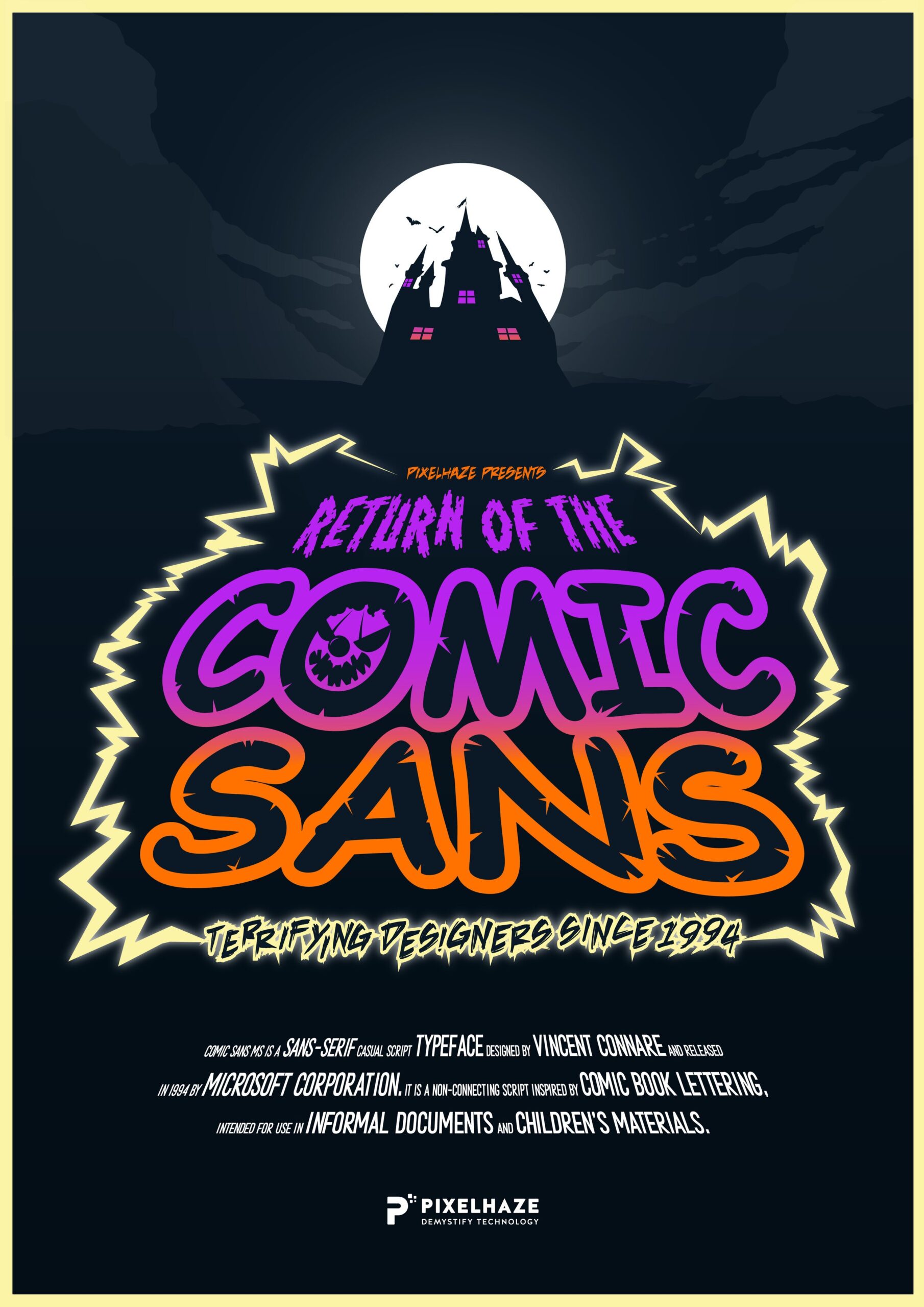
The Return of Comic Sans! Poster Design Now Available
Right. Let’s be honest: if there’s one word guaranteed to send a shudder down a designer’s spine, it’s “Comic Sans.” Around here, its very mention is enough to make tea slosh out of our mugs. And yet, perhaps through black magic, nostalgia, or sheer cosmic mischief, this notorious font refuses to stay buried. In the spirit of Halloween and the haunting persistence of design’s greatest villain, Pixelhaze has conjured up something truly horrific: “Return of the Comic Sans!” A vintage horror poster sure to terrify even the bravest creative.
This poster offers a bit of catharsis, a warning, and a salute to fighting the good fight, all rolled into one. Hang it above your workspace to ward off design disasters.
Why does Comic Sans remain so notorious? Why do good designers keep running into it? And, perhaps most worrying of all, when is it ever a valid choice? We can explore these questions and learn how to handle the return of Comic Sans, whether you’re facing a client request, an ill-advised school newsletter, or simply need to exorcise some font-related demons from your life.

And, if you make it to the end alive, there may be a treat waiting for you. No tricks, we promise. Probably.
Why This Matters
Every designer has, at some point, been asked to use Comic Sans. Sometimes it comes from a client with fond memories of Microsoft Publisher circa 1999. Other times, and worse still, it’s internal: a moment of temptation when a project feels so informal or child-friendly you almost believe Comic Sans is the answer.
The trouble is, this font carries baggage. Epically so. Using Comic Sans can tank your professional credibility, dilute your client’s branding, and send the message that you don’t really care about detail or consistency. For agencies and freelancers alike, this translates to time lost defending your choices, awkward emails, visually painful proofs, and a reputation wobbling on the edge of disaster.
Perhaps you’re not wasting hours on font debates, but money. The “quick Comic Sans fix” often requires expensive rebrands when it’s time to get serious. At Pixelhaze, we’ve seen perfectly good sites lose authority and prospective clients with one careless font decision.
All this, lurking in the cheerful, loopy lettering of a typeface meant for comic-book speech bubbles. Haunting, really.
Common Pitfalls
Don’t worry, you’re not the only one. Here’s where most people fall into the Comic Sans trap:
- Assuming Approachable Means Unprofessional
When people want their message to feel friendly, they reach for Comic Sans, thinking its rounded shapes say “I’m just a regular person, not a big scary brand.” In reality, it often says, “I have never met a design system I didn’t want to ignore.” - Letting Nostalgia Win
We all remember our first PowerPoint. Some of us wish we didn’t. Comic Sans tugs those heartstrings, and people forget to question whether their audience loves a trip to the ‘90s as much as they do. - Client Is (Always) Right Syndrome
When someone pays the invoice, there’s a temptation to hand over the keys. Clients may insist they “only like Comic Sans.” Without a nudge in the right direction, you both risk ending up in the Font Hall of Shame. - Panic in the School Staffroom
Let’s not beat around the bush: schools love Comic Sans. Posters, letters, permission slips. Like zombies, these documents multiply, and before you know it, your painstakingly crafted school website is undone by a Comic Sans header. - Overlooking Consistency
You can have beautiful colours, the perfect layout, and clever icons. One rogue Comic Sans headline, and the whole thing looks like your brand has a budget of £12 and an AOL email address.
Don’t panic. Every designer falls into these traps now and then. The difference comes from how you climb back out and how you steer clients clear of the quicksand.
Step-by-Step Fix
Step 1: Spot the Warning Signs
The first thing you need to do is catch Comic Sans before it infects your design. Like any good horror film, prevention is better than cure. Be alert for phrases such as:
- “Can we just make it a bit more fun?”
- “I want something less formal.”
- “Maybe something like that comic-y font from back in the day?”
The moment you hear these, break out the garlic (or, at the very least, your best alternative font suggestions).
Keep a one-page cheat sheet of Google Fonts or system fonts that deliver approachability without sacrificing professionalism. Sweet Sans, Comic Neue, Quicksand, or Cabin Sketch often save the day with nary a wince.
Step 2: Understand the Client’s Real Fears
This bit is where you earn your stripes as a creative. That desperate grab for Comic Sans is usually a symptom, not the real problem.
Is the client afraid of alienating parents? Do they fear looking ‘too corporate’ for a school fête? Are they desperate to make their charity appeal less stuffy?
Ask good questions, dig deeper, and show empathy. Most of the time, they’re not looking for Comic Sans, but for warmth, authenticity, or a sense of fun.
Tell stories. “We once helped a nursery that wanted Comic Sans but fell in love with Poppins instead. Same friendliness, less… trauma.” A before-and-after image works wonders here, too.
Step 3: Offer Smart Alternatives (With Visual Proof)
Arm yourself with more than polite refusals. Nothing convinces a client (or principal, or committee) like seeing for themselves. Create two or three fast mock-ups: one with Comic Sans, one with a modern friendly typeface, and maybe one with something more sophisticated.
Let their eyes do the work. Go the extra mile: line up the options side by side and ask, “Which one would you trust to run this event?”
Keep a quick template handy in Figma, Canva, or even PowerPoint. Five minutes of prep time now can save hours of email back-and-forth later.
Step 4: Establish Font Guidelines Early
If you’re building a website or working on a recurring print project (newsletters, posters, school comms), get your font guidelines locked in from day one. Create a simple guide, no jargon required, showing primary and secondary fonts, sizes, and even forbidden fonts (complete with dramatic flourishes; perhaps, “Here Be Monsters: Comic Sans, Papyrus, Impact, etc.”).
Making these choices early isn’t about controlling taste; it’s about building trust in your expertise. When your client feels confident, they are less likely to go off-piste.
Add a splash of humour. One of our schools adopted the tagline: “No Comic Sans Zone: Trespassers will be lightly ribbed in assembly.” They’ve never looked back.
Step 5: Use Comic Sans Intentionally (Rarely and Boldly)
There are times when Comic Sans belongs. Comic book speech bubbles. Super-informal party invites for under-tens. Posters that are intentionally tongue-in-cheek, such as a Pixelhaze Halloween horror special.
If you’re going to use Comic Sans, be upfront about it. Make the meta-joke clear. Pair it with bold colours, over-the-top design, or even fake film credits for extra drama.
If you do use Comic Sans, exaggerate the joke. It won’t confuse people if you make it crystal clear that you know exactly what you’re doing (and you’re doing it with a wink).
Step 6: Celebrate Cautionary Tales (Like Our Poster)
Sometimes the best way to steer clear of a design disaster is to leave a reminder. This is exactly why we created the “Return of the Comic Sans!” poster: a glorious, overblown homage to everything that keeps designers awake at night. Hang it above your desk, show your clients, or just give yourself a smile on a rough Monday morning.
You can download the poster here or order one for the studio wall. Treat it as your talisman—proof that you survived another Comic Sans scare.
Share a photo of your own workspace with the poster—bonus points for creepy lighting and overly-dramatic captions.
What Most People Miss
The essential skill for surviving the Comic Sans curse is understanding so-called ‘bad’ fonts. Experienced designers know when and how to say no, when to educate, and, just occasionally, how to own a joke. A true professional sees the difference between a client’s actual goals and their impulsive requests.
Rather than chiding Comic Sans-lovers, bring them into the creative dialogue. Unpack the reasoning behind friendly versus amateur. Let them feel heard, then deliver something that actually matches their audience and goals.
Understanding Comic Sans means understanding the people who (still) ask for it. Meet them where they are, then guide them away from the abyss.
The Bigger Picture
Mastering this approach protects you from more than just one annoying font. You will:
- Save time (no endless font arguments or revisions)
- Protect your brand credibility (and that of your clients)
- Educate future decision-makers, helping eliminate “Can we use Comic Sans?” emails from your inbox
- Build trust with clients or stakeholders who see you as a genuine partner, not just a hired hand
- Enjoy a bit of tongue-in-cheek fun now and then with the poster
Ultimately, the way we handle Comic Sans is a mirror for a solid design practice. Strong boundaries, education, patience, and a sense of humour will carry you a long way.
Wrap-Up
Comic Sans has acquired its villain status through overuse, insecurity, and design-by-committee decisions. Choose your weapons wisely, arm yourself with alternatives, and keep the creative conversation open. If all else fails, there’s always a “No Comic Sans Zone” door sign—or a tastefully terrifying poster from yours truly.
At Pixelhaze, we turn design nightmares into learning opportunities. Our “Return of Comic Sans!” poster is yours to download, hang, or simply admire. For more advice, dry wit, or to join a tribe of creative survivors, join Pixelhaze Academy for free at https://www.pixelhaze.academy/membership.
May your kerning be tight and your font choices deliberate. May Comic Sans only ever haunt you as a cautionary tale or a very, very good joke.

Related Resources from Pixelhaze
- Themed NHS Pop Culture: Social Distance Posters
- The Website Blueprint: Creating with Pixelhaze
- Ken’s Top 5 Tips for Undergraduate Designers
- Squarespace Design Trends (and How to Nail Them)
Download your “Return of Comic Sans!” Poster
Keep bad fonts in check. Hang it loud, hang it proud.