#CoffeeClip006: Add multiple hero sections to your Squarespace website
Why This Matters
Spend just a few minutes browsing the internet, and you’ll quickly spot the difference between websites that greet you with one lonely banner and those that guide you through a sequence of bold, immersive hero sections. These stacked image or video panels serve as your digital handshake, pitch, and signpost all in one. They break up the page, focus attention, and draw the eye down into your story.
Unfortunately, adding more than one of these visual statements to a Squarespace site can quickly become an exercise in banging your head against the keyboard. Maybe you’ve spent hours experimenting with the page editor, only to end up with a frazzled look, a handful of support tabs open, and a half-finished site that feels flat. That can be a real setback when you want to establish credibility, keep visitors engaged, and quietly nudge them toward what matters to your business.

Here at Pixelhaze Academy, we get a steady trickle of messages on exactly this:
“How do I add more hero sections? Can I have several banners on one page without hiring a developer?”
If you’re building your brand, time is money. Every minute wasted wrestling with the platform is a minute not spent attracting new clients, promoting your work, or sorting out the rest of life’s little admin tasks.
If this describes your situation, don’t worry. You’re in the right place.
Common Pitfalls
Most Squarespace users fall at the very first hurdle: mistaking a “banner image” for a “hero section.” There’s a subtle difference. Banner images sit at the top of a single page. A hero section, done properly, is a full-height, attention-grabbing panel that can appear repeatedly throughout a one-page site. This structure gives you several opportunities to introduce, promote, or signpost your best work.
Common areas where trouble starts include:
-
Missing Out on Index Pages
Many assume you need custom code or a pricey plugin, ignoring the built-in functionality of index pages. -
Wrong Template Choice
Not every Squarespace template supports the kind of banded structure you see on visually rich sites. If you’ve picked one of the older, less flexible templates, you’re in for a long slog. Achieving multiple hero sections may not be possible with certain templates. -
Inconsistent Branding or Visual Overload
Even when people do manage to add extra banners, they often end up with a Frankenstein’s monster of styles and clashing messaging. That can undermine a seamless, professional impression.
Before we tackle the step-by-step fix, picture this: a site that guides visitors smoothly from section to section, each with its own striking visual backdrop. You can have this, and no, you don’t need to learn to code.
Step-by-Step Fix
1. Pick the Right Template (Hint: Brine is Your Friend)
You could use trial and error here, but I recommend saving yourself some hassle and choosing from the Brine family of templates (if you’re using Squarespace 7.0). Brine supports index pages by default and works well with modern design requirements. If you’ve accidentally picked something like Bedford, you’ll have fewer options and more workarounds to consider.
To check your template:
- Go to Design > Template in your site dashboard.
- If you see “Brine,” “Mojave,” or “Five,” you’re off to a good start. If you spot “Bedford” or anything not in the Brine lineup, consider a switch if you want this effect.
If you’re already halfway through your build in a non-Brine template and feeling brave, consider starting fresh with Brine. It’s easier to get the structure right at the start than patching it up later. Back up anything mission-critical first. Squarespace doesn’t swap templates as seamlessly as you might expect.
2. Use Index Pages to Stack Your Hero Sections
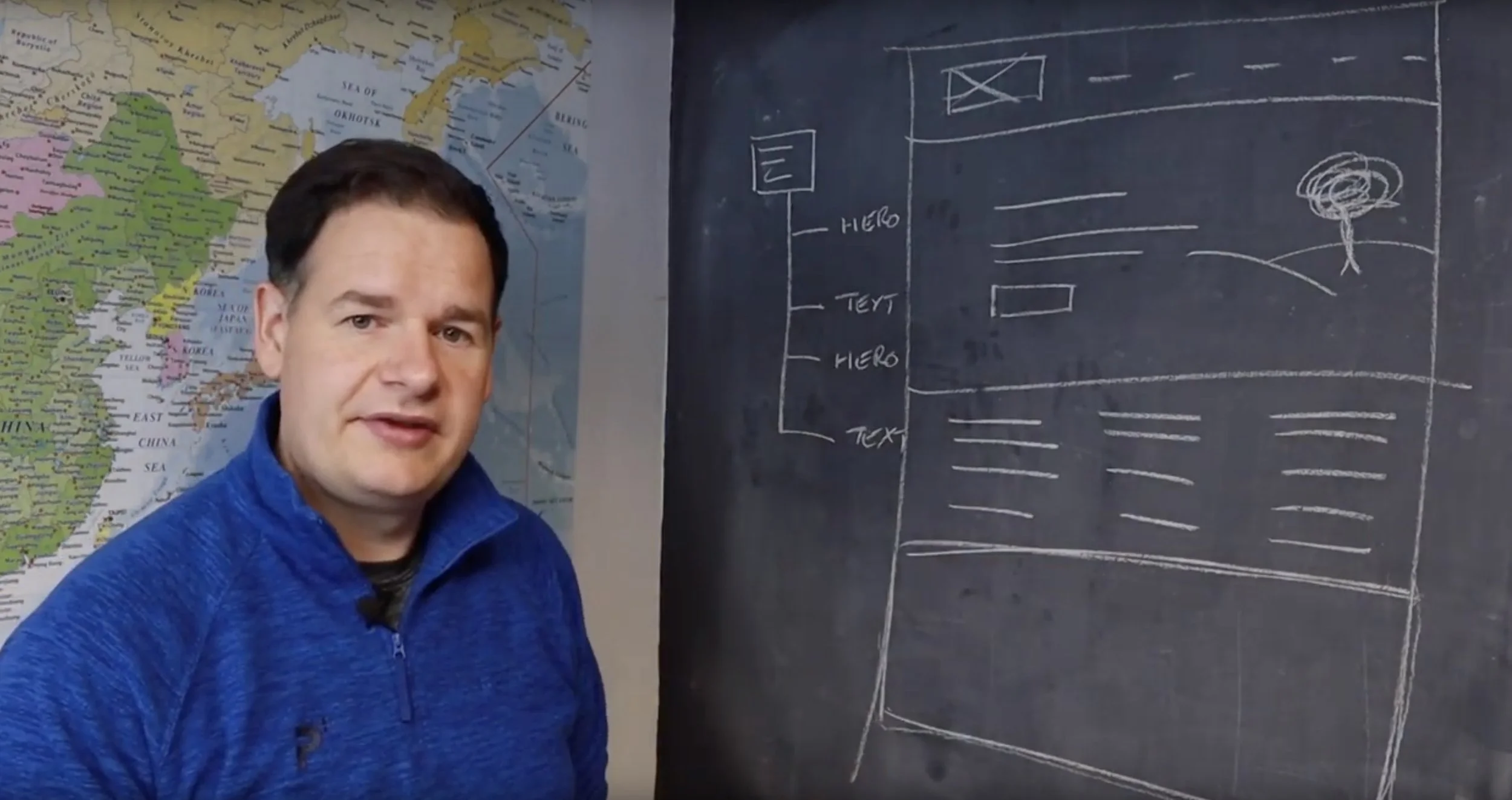
Index pages are a Swiss Army knife of Squarespace design once you know where to look. They let you stack multiple “sections” (which are really just pages) vertically, creating the multi-banner, scrolling effect you see on sleek agency websites.
To create an index page:
- In your main menu, click “Pages.”
- Hit the “+” symbol and choose Index (not regular “Page”). Name it—something like “Home” if it’s your main landing space.
- Under this new index, start adding regular pages. Each page will become a separate “band” or section. These can be anything from feature panels to contact forms, but for hero sections, choose the Banner or Cover page layout each time.
- For each “banner”/section, upload different background images or videos, set overlay colours, and enter unique headings or calls to action.
Now, when you preview the index page, you’ll see your hero sections stacked one after the other, each making its own statement while clearly part of a bigger picture.
Don’t just slap any old photo in as a background. Consider the sequence: introduction, services, testimonials, contact. Each needs a clear focus that invites the user to keep scrolling. Plan it like a storyboard rather than a Pinterest collage.
3. Configure Each Hero Section for Impact (Avoid Cookie Cutter)
There’s a temptation to make each hero section a carbon copy, just with a different image. Resist it! Use the flexibility of index pages to show real variety:
- Text Hierarchy: Each hero can feature a different headline, subheading, and call to action.
- Media Mix: One might be a striking static image, the next a bold coloured block with a short video or animation.
- Section Heights: Use the page settings panel to adjust how deep or shallow each section is. Not every hero panel needs to fill the screen.
Effective hero units work together to pull visitors along, with each offering a new reason to stay on the page. If every section shouts, people will stop listening.
Use honest, natural photography and keep text punchy. Remember what happens on mobiles: busy backgrounds and wordy headlines mean no one reads them. Always preview on a phone and tweak contrast if needed.
4. Keep Branding Consistent from Section to Section
Jarring shifts in colour scheme or styling can leave your site looking amateur. Set a palette and define a visual language before building. Tie each hero section together with repeating fonts, colour overlays, or shared graphic elements.
Consistent primary buttons and headline fonts will serve you well. If you’re using overlays, keep them in the same colour family. Using photos from different sources? Apply a subtle transparent overlay to unify them.
Squarespace lets you save colours and tweak fonts under Design > Site Styles. Set these up before you start; this will save you editing time later. If you’re stuck for inspiration, take two minutes to browse sites like awwwards.com to see how professionals mix discipline with creativity.
5. Optimise for Mobile and Performance
Most Squarespace templates do an acceptable job of resizing hero sections for mobile devices, but that doesn’t let you off the hook. Big hero images can get cropped in unpredictable ways on smaller screens, while your carefully crafted text can become unreadable if left unchecked.
- After building your desktop view, toggle to mobile preview within Squarespace.
- Adjust each hero’s layout, image focus, and text size. Use less text on mobile panels where possible.
- Check loading speeds: If you find a particular hero section feels slow to load, optimise your images. Squarespace recommends images smaller than 500 KB where possible, even for banners.
Watch out for text disappearing into background images on mobile. If you’re struggling, use a semi-transparent overlay block. It makes your text pop and helps people who aren’t browsing on a large screen.
6. Add Clear Navigation and Anchors
If your site has several stacked hero sections on a single landing page, consider adding simple anchor links or a “back to top” button for users who don’t want to scroll endlessly. Use consistent navigation that appears as the user scrolls, and make sure your calls to action are always visible.
- In each hero section, you can add an “anchor” block to allow users to jump straight to a particular panel.
- For longer pages, enable a sticky menu for improved usability.
Label anchors in a way that makes sense to a real human. Use descriptive labels like “Our Work,” “Why Choose Us,” and similar. This improves SEO and creates a better user experience.
What Most People Miss
The difference between a site that’s presentable and one that truly impresses usually comes down to thinking about the user’s journey. Many people focus on placing one banner after another, expecting visual features to handle everything. In reality, how you sequence and flow content makes the biggest impact.
Ask yourself:
- Does each section logically build upon the previous one?
- Are you moving from introduction, to value, to proof, to call to action?
- Do your visuals look considered, or like leftovers from three unrelated projects?
When you pay attention to the story your site is telling, the design falls into place. Experienced designers focus on how the narrative unfolds; this approach gets results.
The Bigger Picture
A website with banded hero sections makes navigation intuitive for visitors and quickly builds trust and understanding. You’ll see people spend longer on your pages, click through to your main offers, and leave with confidence in your expertise.
For freelancers and small businesses, this method helps you present yourself on the same level as bigger agencies, even if you haven’t invested in a six-figure web build. When you spend less time on technical workarounds, you can focus on the message and imagery that actually win new clients.
You can also keep your site current. When you launch a new product or service, just add a new panel. There’s no need to overhaul everything. Updating a testimonial or case study? Simply add a fresh hero section partway down the page, and it will fit right in.
Wrap-Up
To sum up, using index pages in a flexible Squarespace template (such as Brine) gives you an effective way to add multiple hero sections to your website.
Plan your sections with care, keep things visually and thematically consistent, and always build with your end user in mind.
Get these steps right, and your site will finally have the flow, energy, and polish that grab attention and convert, without unnecessary frustration.
Want more helpful systems like this? Join Pixelhaze Academy for free at https://www.pixelhaze.academy/membership.
Still stuck, or want to take things further?
Our free Pixelhaze Masterclass covers everything from layout mastery to professional photography tips, including full walkthroughs for complex page structures. Dive in, post your questions in our community, or watch #CoffeeClip006 and the rest of our growing library on YouTube.
If you found this guide useful, don’t forget to subscribe to our channel for more hands-on advice.
Jargon Buster
- Index Page: A special type of page in Squarespace that lets you stack multiple sections vertically, perfect for banded layouts with several hero panels.
- Brine Family Template: Squarespace 7.0’s most flexible template range, supporting index pages, complex layouts, and deep design customisation.
- Hero Section: A large, visually striking section (normally with a background image or video and text overlay) intended to grab attention and introduce key content.
- Anchor Links: Clickable links that jump the visitor directly to a specific section lower down the same page.
FAQ
Q: Can I add multiple hero sections using Squarespace 7.1?
A: 7.1 uses a slightly different page structure, but you can achieve a similar result using the “section” builder on a single page. The process of stacking full-width panels is largely the same. Be aware of template-specific details.
Q: My background images look blurry or oddly cropped. What am I doing wrong?
A: Make sure your images are large (ideally at least 2500px wide), optimised for web, and set to the correct focal point in the page settings. Test on desktop and mobile, and check that overlays are used for text clarity.
Q: Is there an easier way to keep all my hero sections looking consistent?
A: Yes. Set your base colours, fonts, and spacing using the Site Styles menu before you start. Use branded overlays for image consistency, and keep heading styles uniform.
Q: Where can I find more help or real-life examples?
A: The Pixelhaze Academy community includes designers and business owners sharing screenshots, tips, and feedback. Membership is free, and you can post your questions or even request a review from Elwyn and the team.

Related Posts from Pixelhaze Academy:
- How to boost your local listing on Google Maps (#CoffeeClip008)
- Improving your Squarespace blog post layouts (#CoffeeClip007)
- Working with headings in Squarespace (#CoffeeClip005)
- How to take photos for Squarespace banners (#CoffeeClip004)
- Bitmap vs Vector image formats: what’s the difference? (#CoffeeClip003)
No more staring at a blank canvas. With the right template, a clear structure, and a handful of practical tips, you’ll have your banded hero sections up and running in less time than it takes to make a decent cup of coffee. (If you have questions, post them in the comments. Elwyn has probably read your question before, and there’s always time for one more Coffee Clip.)