A Bit of a Shock: A Deep Dive into Bolt’s Rebrand and Web Design Overhaul
Why This Matters
If you've ever clicked onto a website and instantly felt that prickle of familiarity, that's not an accident. Brands pour a mountain of thought (and a fair chunk of change) into building an online presence that sticks. Standing still for long periods leads to users drifting toward more daring options.
For business owners, marketers, and designers alike, a full rebrand feels risky, much like swapping out the engine on a fast-moving train. The temptation is always to play it safe. Yet playing it safe often results in becoming forgettable and blending into the background. Getting it wrong is expensive. It chews up time, sinks morale, and can send loyal followers into the arms of a flashy new rival.

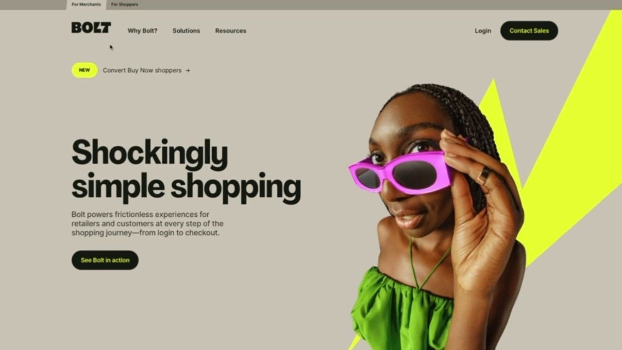
Enter Bolt. Previously, their site did everything it should: clean lines, corporate palette, nothing to scare the horses. And yet, when the market started to race ahead, they made a move most would consider bonkers. They pivoted to a zesty electric yellow and put “A shockingly simple rebrand” front and centre. To some, this choice looked drastic. To others, inspired. But one thing was certain: it got people talking.
When a brand like Bolt shuffles off its old skin, everyone pays attention. Customers, investors, employees, even your nan—each group forms opinions based on first impressions. That’s why rebranding matters: it is not just window dressing, but the shopfront, the handshake, and sometimes the entire product in a single glance.
If you’re weighing up a similar shift or just love a good ‘before and after’, read on. I’ve spent months watching Bolt’s journey and, frankly, have a few thoughts to share.
Common Pitfalls
Let’s get one thing straight: most rebrands falter because of muddled purpose, not for lack of colours or clever taglines. Here’s where I see people trip over their own feet again and again:
1. Treating it as a paint job: Swapping out the logo, buying a trendy font, and calling it a day. All style, no substance.
2. Ignoring the story: Focusing on what looks pretty for the designer’s portfolio, not what fits the brand’s evolving place in the market.
3. Fear of backlash: Watering down changes to avoid offending loyal customers, leaving you with something bland and unmemorable.
4. Underestimating the user experience: Thinking bold changes live only ‘above the fold’, and forgetting that clarity and navigation count just as much as colour.
5. No plan for after launch: Teams often treat the big day as the finish line. In reality, it’s lap one. If you’re not talking to your audience and measuring their reactions, expect a silent site and falling engagement.
“Rebranding should never be only a visual makeover; unless you want to miss out on the true benefit. Instead, it should involve aligning your identity with your evolving story and values.”
— Elwyn Davies, Pixelhaze
Bolt's upgrade is a case study in doing things properly, warts and all. Let’s break down how to get your own house in order when you’re eyeing up a big leap.
Step-by-Step Fix
1. Get Ruthlessly Honest About the ‘Why’
Before you mess with a single pixel, have an awkward, warts-and-all conversation about motivation. Too many rebrands get greenlit because someone on the board is bored, or a competitor changed their header image last week.
For Bolt, their original look—cobalt, grey, and black—communicated “professional,” yet felt tepid in a market where vibrancy often wins hearts and minds. Their shift was admitting the old face no longer told the right story, rather than chasing trends.
Action: Break out the post-its and ask: Are we still speaking to our users? What do our competitors shout from the rooftops that we tiptoe around? Whose attention are we craving and why?
2. Audit Your Brand’s Current Story and Visual Luggage
Avoid discarding what works just for the sake of change. Pull up every asset: your old site, banners, business cards, that banner from the 2017 expo. Find the strong elements. What bits make people smile, click, or stick around longer?
Bolt’s earlier website did the job, but in the way a vanilla milkshake "does the job." After hours scrolling, nothing much lingered in the memory. Their new site, splashed with electric yellow, stands out because it risks alienating the grey crowd.
Action: List all the visual and tonal elements in your current arsenal that genuinely resonate. Survey real users—don’t just trust internal opinions.
3. Design With Purpose—Every Colour, Font, and Pixel
When Bolt’s designers chose electric yellow, it was not a random pick from the Crayola box. Yellow (especially this bold, chroma-laden kind) can appear cheerful. It’s attention-grabbing, modern, and sometimes even a bit cheeky.
They didn’t wash the entire site in custard. Yellow appears as punctuation, acting as impact colour instead of background noise. The decision is strategic, sparing, and impossible to ignore.
Action: Start with your palette. What do your colours mean to you, not just overall, but in context? Dive into colour psychology: yellow signals energy, blue signals trust, red means urgency. Be deliberate.
Typography also deserves more attention. For Bolt, the typefaces moved from softer, reserved sans-serifs to bold ones. Serif fonts stayed out, but the new font weights feel like every sentence is underlined.
4. Sweat the Details: Tiny Tweaks, Big Impact
“Sometimes, what is seen as an innocuous choice of changing the colour can turn a brand from being just seen to being truly memorable.”
— Elwyn Davies
Big rebrands don’t survive on headline features alone. The whitespace, the button corners, the line spacing—every tiny decision adds up.
Bolt’s new site, for example, is more than a paint swap. Spacing feels roomy, navigation’s been streamlined, calls-to-action now stand out instead of hiding. Even micro-interactions such as the way menus expand, hover effects, and icon consistency show the fingerprints of a team who carefully considered each detail.
Action: Don’t tick off design subtasks and move on. Each update should be tested on real humans, on different screens, in different light conditions. Accessibility—a horribly underappreciated factor—has to stand up to scrutiny.
5. Communicate the Change, Then Keep Listening
A rebrand without context causes confusion. The switch from cobalt to yellow on Bolt’s site might have sparked grumbles if it wasn’t paired with a pun-laden tagline, “A shockingly simple rebrand,” and explanatory messaging throughout the experience.
Don’t implement changes and disappear from the conversation. Instead, treat the launch as the start of a conversation. Onboard your users, explain your thinking, and actively request feedback.
Action: Craft an honest, jargon-free post explaining why you’ve updated your brand, what it means for users, and what hasn’t changed. Promote it in email, across landing pages, and on social.
6. Iterate—And Know When to Pause
Bolt’s site continues to evolve (designers never switch off that urge to tweak), but they avoided relaunching something half-baked or reversing every bold move after the first Twitter comment. Balancing ongoing evaluation and trust in the initial research and build is key.
Action: Set up analytics dashboards to track how users behave before and after the overhaul. Pay particular attention to any sudden dips or upticks in engagement linked to design shifts.
What Most People Miss
Honesty and user focus determine whether a rebrand feels clever or forced. Mimicking popular elements from elsewhere is easy. Digging into your brand story and defining your appetite for risk is braver and more rewarding.
Bolt’s approach shows subtlety. They could have saturated the site with yellow or overloaded it with unnecessary motion graphics. Instead, they let a single, bold colour realign the brand, allowing supporting elements to reinforce the new direction, but without overwhelming users.
The gradual unveiling was also important. Bolt didn’t introduce everything at once. Social media started to hint at new directions, homepage banners signalled a shift, and typography changed step by step. Often, the most effective transformations happen through carefully timed delivery rather than dramatic reveals.
One last consideration: don’t let internal buy-in lag behind. The folks answering live chat, invoicing customers, or supporting users after hours need to understand and support the new look and voice. Train, reassure, and make sure everyone can communicate the refreshed identity with confidence.
The Bigger Picture
Bolt’s leap was more than an attempt to be noticed. Well-executed, bold rebrands can achieve the following:
- Win over new supporters who might have overlooked you before
- Give your team a unifying sense of purpose and renewed mission
- Show clearly: “We’re growing, not standing still”
- Prepare your site for changing tastes and technologies
- Help your brand claim a new, memorable visual position
What matters most is that the website isn’t simply brighter or the headlines punchier. At every level, the brand’s new identity is intentional, appropriate, and progressive. Avoid making changes just to seem trendy.
You don’t take this sort of step every few months. Once you commit, you’re opening a new chapter, not just redesigning your homepage.
Wrap-Up
Bolt’s journey is a timely reminder: even the safest brands can benefit from showing some boldness. A clever rebrand requires a look beneath the surface, returning to your promise to users and considering whether you are really delivering on it.
If you’re considering a rebrand or planning to keep your online presence current, begin with honesty and a thorough audit, not just with the colour picker. Taking thoughtful risks, as Bolt did with their yellow overhaul, can set apart those brands that get noticed from those that are remembered for all the right reasons.
Share your thoughts—did Bolt get it right with their lightning-bold move, or do you lean toward more muted palettes? Let’s keep that discussion open.
Want more helpful systems like this? Join Pixelhaze Academy for free at https://www.pixelhaze.academy/membership.
Related Pixelhaze Resources
- Why It's Still Important to Fact-Check AI Tools Like ChatGPT
- What Does a UX/UI Designer Do in Web Design?
- Mastering YouTube Thumbnails with Canva: A Practical Guide
- Photoshop Tutorial: Transforming AI-Generated Images into Retro-Futurism Artwork
- Announcing the Squarespace Designer Power Pack
- Image Compression in Web Design: Why It Still Matters in 2024
FAQs and Jargon Buster
FAQs
What is the main goal of a rebrand beyond visual changes?
To realign your visual identity with your evolving story and values, so users feel the change as much as they see it.
How can colour influence brand perception in web design?
Colours trigger emotions and set tone. Electric yellow can signal innovation, and navy blue suggests trust. Making intentional choices here matters.
Why are details like typography and spacing crucial?
They affect how readable, welcoming, and “finished” your site feels. Miss them and users notice—even if they’re not sure why.

Can I just update my logo and call it a day?
You can, but that misses the point of meaningful transformation. Users are experienced—they can tell when the change is only superficial.
Jargon Buster
- Rebranding: Overhauling a company’s image, from logo and website through to tone of voice and customer experience.
- Colour Psychology: How colour choices affect perception and emotion.
- Typography: The art of shaping how text looks to increase appeal, tone, and readability.
Have you gone through (or survived) a rebrand? Share your stories, horror or triumph, below. Or pop over to Pixelhaze Academy for more hard-won insights and a community of fellow web adventurers.