A Guide to Squarespace Lists
Why This Matters
If you’ve ever wasted an afternoon wrangling with Squarespace layouts, you’ll know the pain: trying to stack testimonials so they look neat, getting image galleries to align just so, or making a sliding banner work, all without turning your site into a code-induced headache. You imagine a clean, professional look, but end up with a page that looks more like your sock drawer after laundry day, with bits jumbled everywhere. For small business owners, freelancers, and no-nonsense designers, that sort of mess hurts credibility and, frankly, gives everyone a headache.
Squarespace’s ‘List’ feature steps in right when you need a dependable tool. While it isn’t meant to take center stage and doesn’t draw much attention, it works reliably in the background, quietly keeping everything in order. If you overlook it, you’ll probably double your workload or shell out for custom code maintenance you don’t have time for. Once you learn how to use Lists, you can create a professional-looking, fully functional site with far less effort.

Common Pitfalls
The biggest mistake is ignoring Lists entirely because their name is, frankly, uninspiring. You see “List” in the section picker, imagine a tedious bullet-point mess, and scroll on by in search of the Gallery block or some ‘jazzy’ third-party plugin.
That’s how most people get stuck. They cobble together layouts with multiple image, text, and button blocks, all held together with hope and a dash of “well, it’ll have to do.” Then, when it refuses to align properly or the mobile version looks like the world’s worst jigsaw puzzle, the shouting at the screen begins.
Some try to short-circuit the process with complicated custom CSS. This will either destroy your evening or leave you at the mercy of Google. Others give up entirely, settling for sections that don’t do what they need or end up looking, at best, generic. Instead of being an unfixable mess, Lists offer a path to a better setup. Lists often turn out to be the exact tool that solves problems you didn’t realize could be solved so easily.
Step-by-Step Fix
Step 1: Find (and Add) the Elusive List Section
When you’re building a page, click ‘Add Section’. If you’re using Squarespace 7.1 (and you should be for this!), scroll through the ‘Featured’ and ‘Blank’ layouts. You’ll spot ‘List’ among the options. Ignore your instinct to breeze past.
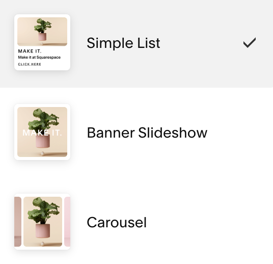
Click it. You’ll be prompted to choose from several layouts: Simple List, Banner, and Carousel. Pick the one that most closely matches what you have in mind—you can switch between layouts easily.
If the List section doesn’t appear, double-check you’re not working on an older Squarespace version. Also, your template must support sections (most modern 7.1 templates do). If you’re still having trouble, reach out to Squarespace support for assistance.
Step 2: Understand List Layouts: Simple, Banner, Carousel
Let’s break down what actually changes with these formats:
- Simple List: Think tidy cards in a row or column, ideal for testimonials, short reviews, or features.
- Banner List: A visually punchy option, organizing your list content into a hero section with space for calls-to-action.
- Carousel: Lets you drop several pieces of content into a horizontal slider. This works well for “client logos”, “staff profiles”, “step-by-step guides”, or event highlights.
In practice, each layout saves you from manually stacking blocks and offers drag-and-drop reordering, built-in image and text handling, and mobile flexibility.
Carousel mode makes sliding banners fast to set up. In minutes, you’ll create something you might have otherwise spent half a day wrestling with in custom CSS.
Step 3: Customise Content and Design (Without a Single Line of CSS)
Once your List section is added, hover over it and select ‘Edit Content’ or the pencil icon. This panel is where you’ll add and edit your cards. Each list item can contain images, headlines, text, and even links or buttons. Click to edit each one.
Play with the layout controls:
- Number of columns: Control how many items show at a time.
- Image shape: Squares, rectangles, or circles. Now you can have round client avatars and team photos without using plugins or approximating circles with square edges.
- Crop settings: Choose exactly how images fit. This helps your company logos line up neatly.
- Infinite scroll: Enable this for testimonials, reviews, or step-by-step sections that loop endlessly—users will appreciate the seamless presentation.
Adjust text size, alignment, colours, and add or remove cards at will. To highlight a particular item (like “Our Chef’s Pick”), simply drag it to the front or reorder the cards as you like.
Adding more steps to a tutorial or more customer reviews is as easy as hitting ‘Add Item’. No more rebuilding your grid or untangling block layouts if you need to make adjustments. For advanced typography, add a touch of custom CSS in the page settings to fine-tune details without affecting the rest of your site’s design.
Step 4: Add Real-World Content: From Testimonials to Step-by-Steps
Let’s see how Lists replace the headache of stacking blocks with a quick example:
- For Testimonials: Each card holds a client photo (crop it to a circle for a polished look), a short quote, and a name. Carousel scrolling organizes testimonials so visitors can flick through at their own pace, not face a wall of tiny text.
- For Step-by-Step Guides: Add a header (“Step One”), an image (circle crop), and a description. Repeat for each step, and let the user move through them without complicated layouts.
- For Product/Service Features: Use a row of cards, each with an icon, title, and a concise description. Everything lines up cleanly and remains responsive.
- For Event Highlights or Sliding Hero Banners: Banner layout helps you mix background images, promo descriptions, and clickable buttons. For scrolling, select Carousel mode.
We use Lists for feature sections, comparisons, customer reviews, and more in client projects and template demos. Take a look at our Squarespace template shop for examples: Lists power feature sections, comparisons, reviews, and more.
Mix Lists with your gallery sections for more dynamic landing pages. Swapping coded sliding hero banners for List carousels saves substantial setup time and prevents future headaches when Squarespace changes its CSS output.
Step 5: Optimise for Mobile and Save Yourself Future Stress
Squarespace layouts adjust well to mobile screens in most cases. However, if you stack enough images, buttons, and text blocks yourself, you risk unpredictable results due to the grid system’s snap points.
Lists address this. Whether you set up six staff profiles, three testimonial circles, or a step-by-step, the List section automatically reflows content for mobile. This is much more reliable than arranging blocks manually.
Preview on mobile and tablet. If anything looks off, adjust the number of columns or card spacing in List settings instead of overhauling the layout from scratch.
Step 6: Reuse and Replicate
Lists work for a variety of content types. Once you’ve styled a section, duplicate it onto new pages, swap out content, and continue running your business. You avoid risky ‘copy and hope nothing breaks’ routines.
When you build a branded feature—like “Our Service Process” or “Meet the Team”—using Lists on your homepage, you can reuse it on landing or service pages. Tweak the content and keep everything consistent, without increasing your workload.
Save your best List sections to your Squarespace ‘Sections Library’ for instant reuse. Very few people make use of this approach, but it can change your site-building workflow for the better.
What Most People Miss
Most folks think Lists are simply for listing content. The real advantage comes when you use them as “content sliders,” mini-galleries, or even modular feature strips. They help you prototype new layouts quickly, test different visual arrangements, and respond immediately to client feedback or last-minute ideas.
Another often overlooked perk: Lists inherit your site’s design system but also offer detailed controls. You can tweak a card’s look easily, without fighting your global design settings.
Perhaps the best-kept fact is that Lists make site maintenance much easier. With fewer moving parts, your site stays organized and needs fewer tweaks. You’ll find yourself making adjustments much less frequently compared to stacking standard blocks.
The Bigger Picture
Squarespace Lists help you streamline your site-building process both now and in the long run. By avoiding endless fixes for broken layouts or messy sections, you gain time to focus on your products, your services, and the experience you deliver to visitors.
For agencies and designers, Lists offer excellent scalability. Build a section once, duplicate it throughout the site, maintain a consistent style, and let clients update content easily without risking site structure. If you manage your own site, using Lists means fewer late-night troubleshooting sessions and more time for everything else.
Wrap-Up
Squarespace Lists may have a forgettable name, but they are essential for anyone building clean, dynamic, and easy-to-maintain sites. Skip the frustration of stacking blocks and maintaining custom code. Use Lists for testimonials, features, guides, and banners. Your workflow improves, your layouts become more robust, and your site leaves a professional impression on every visitor.
Want more helpful systems like this? Join Pixelhaze Academy for free at https://www.pixelhaze.academy/membership.
FAQ & Jargon Buster
Where can I find the List section in Squarespace?
Go to any page, click ‘Add Section’, then look for ‘List’ in the layouts menu. If you can’t spot it, you might be on an older version—Squarespace 7.1 includes the List feature.
Can I make images circular without code?
Yes; use the image shape settings inside List. No plugins or extra fuss.
What’s the difference between Carousel and Gallery blocks?
Carousels in List allow you to combine images, text, and buttons on responsive cards. Gallery blocks are meant for plain image grids.
What’s Infinite Scroll in Lists?
Instead of stopping at the last card, infinite scroll loops back to the first. This is useful for reviews, steps, or client logos.
Can Lists save me time if I run an agency?
Absolutely. Design once, duplicate, adjust content—clients get a polished product and you get work done faster.
What about older Squarespace sites?
The List feature is only natively available on Squarespace 7.1 and its templates. If you’re still using an earlier version, consider upgrading.
Jargon Buster

- CSS (Cascading Style Sheets): The code used to style websites. Lists don’t require it.
- Responsive: Looks good on mobile, tablet, and desktop. Lists take care of this automatically.
- Carousel: A slider that cycles through cards or images.
- Grid: The 12-column structure Squarespace uses in its layouts.
- Content Block: The fundamental pieces (image, text, gallery, etc.) you drag onto a Squarespace page.
Related Resources
- Squarespace Custom Graphics – Pushing the boundaries of Squarespace (Without code!)
- Squarespace Templates: What Are They?
- Pixelhaze Store – Squarespace Templates and Kits
Keep your workflow sharp, your layouts even sharper, and your headaches to an absolute minimum. Enjoy using Squarespace Lists as your new go-to feature.
Ready for more? Join Pixelhaze Academy for free and discover time-saving techniques and design strategies that make a real difference.