Adding Personality to your Website with Animated GIFs
Why This Matters
If you've ever scrolled through a website and felt it was missing something, you're not alone. Plenty of sites get the basics right—nice layout, coherent branding, passable copy—and still manage to feel as lively as a doctor's waiting room on a wet Wednesday afternoon. The missing ingredient is personality. Often, the way a site moves (or rather, doesn't) plays a major role in the lack of character.
Web users are spoilt for choice and have little patience for the bland. Your design might be clean, your copy might even be witty, but without a hint of dynamism, people click off and move on. By using a well-placed, well-made animated GIF, your site gains something that's difficult to accomplish with flat images and static icons: genuine character. It’s the digital equivalent of a firm handshake and a raised eyebrow, making the site engaging, memorable, and instantly human. Your users perceive this difference, consciously or subconsciously.

However, there's a practical benefit as well. Stale websites hurt your brand, cost you conversions, and leave you somewhere near the bottom of the “would recommend” list. A good animation, on the other hand, catches the eye, guides attention, lightens the mood, and even helps explain tricky ideas. All without swamping your bandwidth or driving visitors round the bend.
Using the appropriate animated GIF, in the right way, transforms an ordinary page into a brand statement. Getting this right provides a real competitive advantage for any designer.
Common Pitfalls
The number one mistake I see (and if you've built more than two websites, you've probably made it yourself) is thinking more animation is somehow better. This, predictably, leads to things bouncing, sliding, and flickering at every scroll, making the site unpleasant for visitors.
Let's be honest: most people who try adding personality with animated GIFs land on one of three rakes and step right on them.
First: The GIFs are too big. Upload one overcooked five-second masterpiece straight from After Effects and your homepage loads slower than the Welsh Assembly on decision day. Cue frustrated visitors and an email from your developer suggesting you kindly stop “improving” the site.
Second: The animations don’t loop properly. A lurch, a flicker, or a half-second pause at the end ruins the illusion and makes your design seem amateur, no matter how much time went into it.
Third: The content gets lost. Fancy moving icons draw the eye, but if everything is animated at once, nothing stands out, and actual calls to action are drowned out in the noise.
All three are avoidable, but you’d be amazed how often they crop up even on otherwise polished sites.
Step-by-Step Fix
1. Define the Purpose of Your Animation
Before you fire up Photoshop or reach for your animation tools, stop and ask yourself what role the GIF is meant to serve.
Are you trying to explain a concept? Draw attention to a section? Soften the “corporate” feel and add a wink to a page that’s a bit too serious? Or just disguise an awkward bit of empty space that’s always got on your nerves?
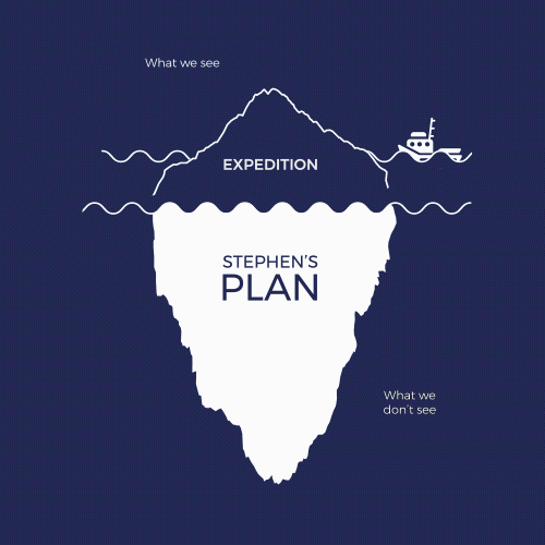
Be specific. For example, one of my clients wanted to convey their “iceberg” business philosophy: surface success with hidden hard work. They weren’t sure how to get this across visually. A simple static illustration felt flat, so we built an animated GIF: a clean, minimal iceberg bobbing gently, with subtle ripples below the waterline to reveal the real story.
2. Plan for Subtlety and Brand Alignment
GIFs should not be seen as party tricks. The most effective ones play quietly in the background and only call attention when needed. Loud, frenetic loops are best reserved for memes.
Before animating anything, revisit your brand guidelines. A playful, youth-focused site benefits from color, bounce, and cheerful movement. An elegant boutique requires a pared-back approach with gentle rotations, soft fades, and subtle hints. Each decision should reflect your brand’s tone.
One of my favourite examples is the animated compass logo we created for Stephen Jones. The animation involved a simple rotation of a few degrees, swaying left and right in a subtle way. You’d almost miss it, but it contributed a sense of precision to the brand. Not a single client commented on “the animation,” but plenty noted how professional the site “felt.”
3. Build the Right Kind of Animation for the Job
Now you know what you’re aiming for, pick your tools accordingly. For simple hovers and micro-interactions, you can often skip the GIF entirely and use CSS instead. These native browser effects are light, responsive, and easy to tweak. Think of things like icons that slide in, or a button that wobbles when hovered over.
If you need more control or want to sync multiple elements in a short, looping sequence, step up to a tool like Adobe After Effects. Here’s how I go about it:
- Design all elements in Illustrator (it’s far more precise for shapes and colours).
- Import these into After Effects, keeping each moveable part on its own layer.
- Animate sparingly. The start and end frames must be identical for a seamless loop.
- Keep the finished animation short—ideally under three seconds.
- Export using the minimum frame rate and palette that still gives a clean look.
You should run the animation through Photoshop or a dedicated GIF optimiser to reduce the file size as much as possible.
4. Optimise GIFs so They Don’t Kill Your Site Speed
This is a common stumbling block. GIFs are inherently inefficient because they function as mini-movies that play endlessly, consuming resources. The key is to compress aggressively to maintain site performance.
Export your GIF at the lowest possible colour depth. The file size drops dramatically by reducing from 256 to 64 colours (or even fewer if the artwork allows). Cut out any unnecessary frames. Don’t hesitate to shrink the dimensions. A GIF only needs to be large enough to remain legible.
If your animation doesn’t need to loop endlessly, consider replacing it with a static image after one playthrough. At Pixelhaze, we developed a bit of code for this purpose: the animation plays once on page load, then quietly swaps to a still PNG. This creates an engaging intro without adding extra load or visual distraction.
5. Integrate Thoughtfully into Your Website Platform
Once the GIF is ready, it’s time to add it to your site. This step sometimes brings technical challenges.
If you're using Squarespace, you can simply drop an image block and upload your GIF. Other platforms might need a bit of HTML tinkering. Test the animation in context, on both light and dark backgrounds, and across both desktop and mobile devices.
If using the one-play code trick, upload both the GIF and a still version, then use a small JavaScript or plugin to handle the swap.
Place your GIFs where they’ll add value, not clutter. A hero banner suits an intro animation, while sidebars, icons, or section signposts can work well too. Don’t use animations without a clear reason.
6. Test, Iterate, and Get Outside Feedback
Once everything is live, check how real users respond. Do they notice and appreciate your animation, or does it go ignored? Worse, does it get in the way?
It’s easy to get “animation-blind” after spending hours tweaking. A five-second loop might be delightful the first ten times but become irritating after the hundredth. User feedback always provides the most reliable insights.
Watch site analytics. If your bounce rate drops and time-on-page creeps up, your approach is working.
What Most People Miss
One important point is often overlooked: The best animated GIFs serve a genuine function beyond just looking good. Adding a touch of character is helpful, but clarity remains the top priority.
Every animation on your site should guide, explain, or reinforce your brand story. Anything else risks being frivolous. Subtlety keeps your site professional. The cleverness lies in designing an animation that seamlessly feels like part of the page, not something added as an afterthought. An animation should work quietly in the background, drawing notice only when users look for it.
Also, not every message fits an animation. Sometimes a well-shot photo, an icon, or a crisp headline will convey your message with more elegance and efficiency.
The Bigger Picture
When you use animated GIFs effectively, several benefits become clear:
- Your bounce rate falls as visitors stay to explore what’s different.
- Navigation becomes easier as people spot the elements you want them to see.
- Your brand feels more unique and crafted.
- Prospective clients remember the site after they’ve left, often because of that small detail that made them smile or pause.
You also save time and money on endless A/B tests. Rather than debating button colours, you can concentrate on fine-tuning subtle motion to drive the right results.
With some technical know-how at your disposal (or with our help if you prefer), you can offer this upgrade to your clients, leading to repeat work and word-of-mouth referrals.
If you use animation well in your web design workflow, your site’s credibility improves, your storytelling becomes sharper, and you show clients and customers you are up to date with current trends and planning for future digital needs.

Wrap-Up
Animated GIFs offer real value when used wisely. Begin with a clear purpose, design with subtlety, keep the file size lean, and test the results. Taking this approach ensures your website functions better, not just looks better.
Want more helpful systems like this? Join Pixelhaze Academy for free at https://www.pixelhaze.academy/membership.