PixelHaze Rebrand: Losing Pixels; Gaining Clarity.
Why This Matters
Let’s set the scene. You’re an ambitious small business or a passionate freelancer, worrying about your website and brand putting people off before you’ve even had a chance to say hello. Your gut tells you: people click away if the tech looks daunting or you seem out of touch. But here’s the problem: most design agencies churn out sites and branding draped in jargon, fuzzy logos, and cryptic symbolism, leaving you feeling more lost than before.
This is not a theoretical nuisance. If your site screams “complexity,” people won’t stick around. Unclear design means lost time and money: prospects look elsewhere, you pay for fix after fix, and every change gets buried under tech speak. You’ve probably already spent enough on branding and digital services that make promises but leave you no better than where you started.
Enter PixelHaze. Since 2014, we’ve made it our life’s work to grab this problem by the scruff of its neck. We want the little guy to understand, thrive, and laugh at the thought of being intimidated by “the big, scary internet.” Our rebrand—a farewell to those famous old pixels—might seem a strange move. But it finally brings our work, our identity, and your experience together in glorious clarity.

Common Pitfalls
Let’s not dance around it. There are classic traps people and brands (and yes, designers) fall straight into:
- Clinging to your old identity: Maybe your logo’s desperate for a refresh, but you’re too attached to history to see it’s holding you back.
- Mistaking complexity for credibility: If your site or brand is full of bells, whistles, and buzzwords, it isn’t fooling anyone. It’s hurting you.
- Fearing personality: There’s a myth that you have to look “corporate” to be credible. In reality, showing who you are—quirks, playfulness, and all—builds trust.
- Thinking a rebrand is just a surface-level “nip and tuck”: Actually, it should be about function over vanity. Great branding solves problems, not just prettifies.
Our own journey had us staring right at these pitfalls… and scribbling our way through a cloud of chalk dust and pixelated nostalgia before we got it right.
Step-by-Step Fix
Time for the practical bit. Here’s how we tackled a rebrand that works for creatives and businesses tired of hiding behind hazy logos or jargon-fuelled nonsense.
Step 1: Reflect Honestly on What You Stand For
Before you even open the sketchbook (digital or old-school paper—your call), ask: what’s the entire point? At PixelHaze, we realised web design was just the start. The real goal was breaking down barriers, translating “geek” to “get,” and making creative tools genuinely accessible.
We started by inviting everyone on the team (from the biggest Star Wars nerds to client-champion types) to write three words: “What does PixelHaze mean to you?” Unsurprisingly, words like “clarity,” “curiosity,” and “friendly” kept cropping up.
Step 2: Embrace Simplicity, Keep Your Personality
It’s easy to think that “simplifying” means “strip away everything unique.” We had that realisation the hard way, staring at logo options that just looked… generic. That’s not progress. The answer? Simplify so you’re clearer and easier to recognise, without becoming bland.
Our pixels in the early logo meant “techy” but they also, if we’re honest, made things fuzzier—literally and conceptually. We chipped away (over several crayon-fuelled pub sessions) until we landed something clean, readable, yet bursting with our characteristic warmth. Out went the haze, but we kept our irreverence and heart.
Step 3: Bake in a Story (Ideally, a Playful One)
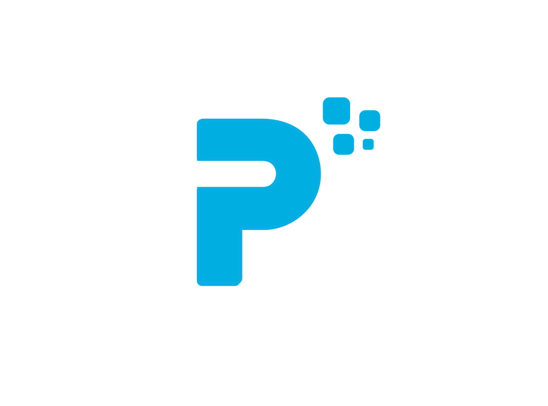
Here’s our secret weapon. In 2019, instead of rolling out yet another abstract shape or “inspired by geometry” monogram, we hid a “?” inside the “P” in PixelHaze. Why? Because questions drive discovery, and we wanted everyone—clients and students alike—to know: No question’s too small or daft.
We even ran a little in-house test: stick the new logo on our studio kettle, wait, and see if anyone noticed the question mark. Watching people clock it (often over a brew), ask, “Hang on… is that…?” showed us what a hidden story can do. That moment of curiosity and connection was magic.
Step 4: Get Your Whole Community On Board, Don’t Hide Behind a Curtain
Some advice bores on about a “big reveal.” We think it’s overblown, unless you’re Apple or introducing a new shape of chocolate bar. When the PixelHaze rebrand launched, we showed work in progress everywhere: team whiteboards, workshops, community Slack. We invited feedback, including from folks who usually hate change.
When clients saw the meaning behind the new look (and watched their own feedback shape it), they felt part of something. This felt like evolution, not a cold, confusing relaunch.
Step 5: Carry the Spirit into Every Corner
This is where most brands flop. They slap the new logo up, update their email signatures, then call it a day. If you’re serious about changing how people see you, you need to change how you act, teach, and design everywhere.
At PixelHaze, the new look didn’t stop at the studio door. We brought the same clarity and playfulness to the Academy, into every workshop we run, and onto every product in the Store. Design became something we do with people, not at them. Fans of our Academy say they feel “in on the secret”—not bystanders, but co-creators.
Step 6: Keep Asking Questions
You don’t need to believe in “growth hacks” to know this: the only thing worse than sticking with a stale look is rebranding once and then switching off your brain.
We built our rebrand to invite questions, inside and out. In our Academy sessions, in client calls, even in graphics, we keep challenging “Why do we do it like that?” This mindset helps us (and our clients) stay on the right side of innovation, not stuck defending old choices.
What Most People Miss
Here’s the trick. People think a rebrand is all about looking new. In reality, it’s about making your message impossible to misinterpret—and keeping your unique spirit in every drop of ink, pixel, and conversation. The world is flooded with polished, personality-free brands. Winners show their quirks, make their mission blindingly obvious, and invite others into the story.
For us, the “childlike curiosity” of PixelHaze isn’t tacked on. It’s baked in. We’re Lego for web designers: inviting, open-ended, infinitely remixable. The clearer our identity, the easier it is for learners and clients alike to join in the fun—and get results.
The Bigger Picture
Solving the brand clarity riddle changes everything. Here’s what happens in practice:
- Faster client wins: No more “So… what is it you actually do?” when people see your logo, products, or site.
- Stronger community: People want to be part of something they understand and can see themselves in.
- Better learning: For our Academy, the shift to simplicity in the brand means everyone, from school leavers to sixty-somethings, feels welcome.
- Unmistakable reputation: Stand out without waving your arms. Authenticity is magnetic, and it’s easier to deliver when there’s nothing to hide behind.
We didn’t just change a logo. We sharpened everything: how we teach, design, and support. That means better digital experiences for everyone who walks through our (virtual) doors.
Wrap-Up
The journey from “pixel haze” to clarity isn’t about abandoning creativity or history. It’s about removing friction, ditching the techy smokescreen, and making your mission as easy to spot as a lightsaber at a chess tournament. Looking sleek for the sake of trend misses the point. What matters is making what you offer simple, honest, and so you that clients and learners can’t help but pull up a chair.
You don’t need to be the biggest or shout the loudest. Be unmistakably you. Let everyone who meets your brand feel a little bit smarter, a little bit more curious, and a whole lot more at home.
Want more helpful systems like this? Join Pixelhaze Academy for free at https://www.pixelhaze.academy/membership.
PixelHaze FAQ/Jargon Buster
Why did PixelHaze decide to simplify its logo and lose the pixelated look?
Our mission is to demystify technology; a logo should tell that story at a glance. The old pixel-heavy logo suited us back in the day, but as we grew bolder and brighter, it was time to lose the fog and light the way.
What’s with the question mark in the logo?
Curiosity is our North Star. The question mark, tucked into the “P,” reminds everyone (us included): there are no silly questions. It’s our job to answer—without jargon.
Did the rebrand change your workshops or approach?
Change didn’t take away what people value. We’ve doubled down on our hands-on, playful approach to learning—helping everyone build, break, and reimagine websites and branding, whatever their background.
Jargon Buster
Pixelated: When graphics look blocky, like old-school video games.
Rebrand: Swapping out your company’s visuals, messaging, or style so people see you with fresh eyes.
Mission Statement: A one-sentence compass. It tells the world what you stand for and why you’ll never apologise for it.
Ready to unlock your creativity and see what clarity can really do for your brand or project? The doors of PixelHaze Academy are always open.