The Goonies: A treasure trove for graphic designers
Why This Matters
Ask any designer what set them off down this colourful, hair-pulling, endlessly fascinating road of pixels and Pantone swatches, and you’ll get a dozen different answers: a battered 90s magazine, the logo on a skateboard, an old video game. For me, it was a battered VHS copy of The Goonies, and, more specifically, the unforgettable poster art and branding that wrapped the whole adventure together.
Why bring this up now? The powers that be have seen fit to greenlight The Goonies 2, and while half of me is clutching my childhood with a look of horror (see: every other reboot ever made), the other half is grinning like Chunk after a Baby Ruth. Whatever happens, the original Goonies remains a shining example of old-school storytelling and visual magic working hand in hand. There are serious, practical lessons here for anyone designing logos, brands, websites—or anything else hoping to worm its way into the brains of real people.
The trouble for today’s designer (and anyone managing a creative brand) is that, faced with so many trends, tools, and “hot takes” on design, it’s far too easy to forget what makes for genuinely memorable visuals in the first place. If you don’t build your identity with the same care (and, dare I say, roguish charm) as The Goonies, you’re just another face in the never-ending digital crowd. That costs time, energy, and, let’s be honest, a shedload of money over the long run.

Common Pitfalls
Let’s be brutally honest: when people try to “go retro”, it often ends up one of two ways.
First, you get the copy-paste crowd who think slapping a few neon stripes or distressed fonts onto a project instantly delivers a wave of nostalgia. Looks like a knock-off Stranger Things poster and feels about as authentic as a glow stick in a pirate’s chest.
Second, you get the design minimalists who assume anything older than their last iPhone update is outdated and belongs in the skip. They miss out entirely on the magic that made films like The Goonies stick around for generations.
And there’s a third culprit: designers who look at pop culture branding as something “nice to have”, not realising that the right visual identity will do half your storytelling for you before a single line of copy appears on the page.
Ignoring the craft behind those legendary posters, logos, and film identities means your designs will always feel like they’re playing dress-up, instead of becoming living, breathing parts of a story. If I’d carried on that way, I’d probably still be stuck hand-cutting Letraset transfers onto a blank CD case instead of, you know, talking to you here.
Step-by-Step Fix
1. Study the real icons, not just the “look”
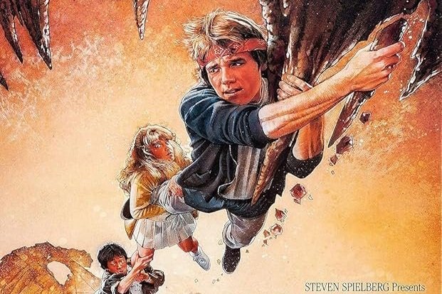
Picture this: It’s 1985, and the cinema lobby is packed with adventure-hungry kids. There among the popcorn and faded carpet is The Goonies poster, painted by the one and only Drew Struzan. Forget stock photos or Photoshop filters. Struzan’s work drips with hand-crafted texture. Every character, item, and shadow is packed with story. He didn’t just paint a collage of faces; he made a promise. See this poster? You’re about to dive into a tale of daring, danger, and mateship, with the odd pirate skeleton thrown in.
Why does this matter for you, sitting behind your MacBook or sketchbook today? Because real icons, whether they’re film posters or brand logos, are built on personality and a laser-focused sense of purpose. Before you even open Illustrator, spend some time digging up the real classics. Look past the filter and see why they work. Snap some screenshots, try sketching your favourite vintage logos, and ask yourself which story is being sold in a single image. Not “does it look 80s,” but “could it only be for this film, this brand, this adventure?”
2. Let your typeface do the heavy lifting
You can spot The Goonies logo from a mile away: uneven, chompy, and perfectly scruffy, like it was carved into a pirate map by shaky kid hands. It doesn’t just spell out a title; it telegraphs the rough and ready vibe of the misfit gang at the heart of the movie. There’s no corporate gloss here, only raw adventure and a real sense that something is at stake.
Compare that to all those modern logos that look like they were spat out of a Sans Serif generator. Which one sticks in your mind longer? (Hint: it’s not the one that could double as an app icon for bottled water.)
When designing, hand-pick or even hand-draw your type where possible. If the brief is “make it feel adventurous,” don’t reach for the nearest generic display font; experiment with uneven baselines, weathered edges, custom ligatures, or even scrawling with an actual marker. The right lettering doesn't just read, it shouts. When it works, you’ll know it because you’ll have clients (or your own inner critic) quoting the catchphrase without even trying.
3. Colour it with intent: make your palette work overtime
Take a closer look at Struzan’s The Goonies poster and the palette he built it with: moody sepias and sunlit golden browns, with pops of electric blue and red. The colours do more than look “cinematic”—they pull you into the world of underground tunnels and dusty treasure chests. Every hue sets the tone, from the warmth of friendship to the shadows of danger lurking in every booby trap.
If you’ve ever caught a 1980s film on TV and felt instantly cosier than your nan’s sofa, colour is doing the heavy lifting. These tones pop up everywhere in the branding, from posters to merchandise. They’re inviting, emotive, and help the visuals linger in your mind.
When you’re building a brand or campaign, don’t lean mindlessly on colour trend tools. Challenge yourself to design three possible palettes that tell a different story: one for comfort and nostalgia, one for danger and excitement, and one for whimsy and chaos. Blend digital colour references with real-world samples (old stickers, magazine ads, sweet wrappers) for that secret “lived-in” look.
4. Integrate product and pop culture the way the 80s did
Product placement, when done well, actually adds truth to your world. In The Goonies, look out for the casual dominance of Pepsi cans, the legendary Baby Ruth bar (as tossed to Sloth by Chunk in maybe the most misunderstood act of friendship on screen), and the scattered Domino’s pizza boxes. None of this shouts “sponsored by!” It just feels like the natural mess you’d find in any real pre-internet home.
The real trick isn’t slapping a logo into your work, it’s asking whether it genuinely belongs in the story you’re telling. Even in 2024, brands sometimes get this disastrously wrong (see: the infamous Starbucks cup in Game of Thrones).
If you’re designing for a project with real products, only include them when they feel right for the setting or deepen the story you’re telling. It helps to look at how The Goonies linked product with character: the Baby Ruth moment isn’t materialistic—it’s pure, character-driven storytelling. That’s what sticks.
5. Collage, texture, and the human touch
Nothing sticks in your head quite like the tactile, layered “collage” look of 80s movie posters. Think overlapping character portraits, props, swirling maps, and oddly placed torchlight beams. This approach did for film posters what a great mixtape does for music: it pulls together the greatest hits into a single, head-turning package.
As designers, too often we flatten and simplify everything, swearing by minimalist layouts and surgical precision. But try adding sketchy elements, scans of real objects, bits of hand-drawn map or scrawled pencil margins to your project. Even digital projects come alive with a touch of hand-built imperfection.
You don’t have to become Drew Struzan overnight, but building moodboards with torn paper edges, scanned textures, and layered illustrations will help your visual identity leap out from the endless scroll of soulless stock art.
What Most People Miss
It’s easy to get swept up in nostalgia for its own sake, slapping on a retro filter and calling it a day. The reason The Goonies stuck with people (and arguably why none of the reboots ever hit the same) comes down to this: every single piece of its identity was telling the same story.
The art, the type, the colours, the product placements—all of it built around living, breathing characters and a sense of real adventure. Modern design can feel so scared of having fun, being messy, or leaning into personality, but honestly, that’s the secret ingredient.
The clever designers aren’t just referencing the past for brownie points; they’re pinching the heart and humanity out of it and giving it a fresh reason to exist. Storytelling comes first, nostalgia is second, and execution follows.
The Bigger Picture
When you crack the code of what made films like The Goonies so impactful, you’re doing more than making nice posters. You’re building a brand that feels “lived in.” That’s how your project gains that “I remember where I was when…” quality.
A handful of small choices—a chunky, hand-drawn logo; a colour scheme that smells of old comic books; product details that actually fit the story—create strong trust and memory for your audience over time. They’ll find themselves quoting your tagline, hankering for your stickers, or in the best cases, making your work part of their own story.
That’s a pretty good result for a day at the drawing board, and it’ll save you months of “rebranding” headaches later on.
Wrap-Up
The Goonies counts for more than another tick-box on the 80s retro film bingo card. For anyone with their hands in the visual arts, it’s a walking, talking, treasure-laden masterclass in how to make every design decision matter. Study its poster, chew on its logo, rewind the film for the product placement, and bring a bit of that adventure, grit, and kid-at-heart wonder into your own work.
Want more helpful systems, real-world breakdowns, and a design community with actual personality? Join Pixelhaze Academy for free at https://www.pixelhaze.academy/membership.
Jargon Buster
- Collage style: Layering multiple images, textures, and illustrations to create a rich, eye-grabbing composition.
- Rite of passage (in stories): Plots about growing up, facing fears, and learning who you are—often with a few runaway skeletons thrown in.
- Hand-drawn type/lettering: Designing letters by hand rather than defaulting to an off-the-shelf font, and usually scruffier, always punchier.
FAQs
How can I introduce 80s styles without my design looking outdated?
Borrow the heart, not just the look: build a genuinely story-led identity, mix in analogue textures, and keep your execution sharp. Don’t just copy, remix and reimagine.
Why did The Goonies branding work so well?
Every piece of the puzzle (logo, palette, poster) told the same story—adventure, friendship, and danger with a lovable, messy twist.
Is there a risk of going too heavy on nostalgia?
If you focus on telling a true, character-driven story, nostalgia becomes your seasoning, not the main course.
How do I make product placement feel natural in my design or story?
Tie it to the world: include brands and products where they make sense for your characters or setting. If it feels like an advert, you’ve gone too far.
Do I need to be an illustrator to channel these approaches?
No, but experimenting with sketching, collage, or hand-drawing a few titles can give digital designers a sharper eye and stand-out results.
Go forth and design bravely. Sometimes all it takes is a Baby Ruth and a bit of scruffy lettering to make something stick for life.